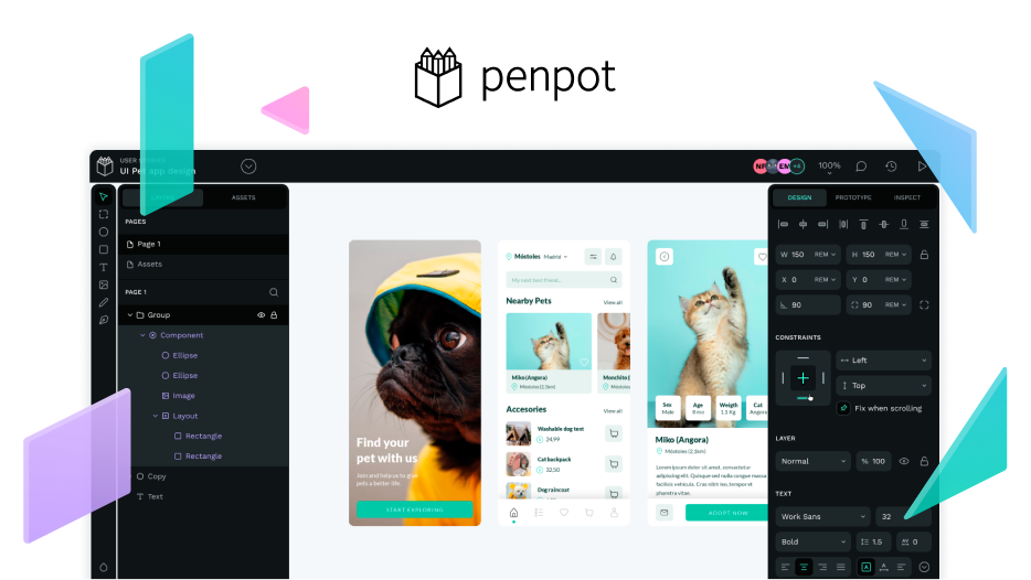
Thoughts on Penpot’s User Interface

One of the biggest challenges in designing a tool like Penpot is its user interface.

There are a large number of variables to consider, such as accessibility, content management and hierarchy, use and behavior of functionalities, interactions between users,… and more.

Before starting, it’s important to collect feedback and learn from the community. We gain valuable insight from the users that has influenced us in creating and prioritizing interface improvements. Once we have contrasted and analyzed these improvements we shaped a design process to solve users problems and needs.

Regarding accessibility, we have done a research that has revealed the points of improvement. Developers and designers are working on Penpot’s usability to ensure any person can use it comfortably and without major complications. Naturally, this isn’t an issue that we’ll solve overnight, as it has many implications.

Simplifying the interface is the other main task we are working on. It can be difficult to onboard users to new and complex interfaces and workflows like the ones Penpot has. Too much information can easily overwhelm the user and make it difficult to keep the focus on the essential feature or functionality.

The visual weight of the interface of a tool like Penpot is very remarkable. That is why we are focused on simplifying the visual load looking for a cleaner result but still impressive and powerful content creation.

As a user, what do you think we could improve?

13 Likes

UI is nice and very clean for me :+1: I hope that you would add integrated space for community files without have to download them separately.

4 Likes

Thank you so much for your words @merih :grinning:

It is definitely something that penpot must have. We are working on defining the best possible scenario for users to share their work.

4 Likes

Interface is very good… but I still don’t know how to switch on white theme… unless it is still in the testing phase. :slightly_smiling_face:

In addition, it would be nice if you could integrate Lorem ipsum generator according to variables (tittle, paragraph, data, name, adress, phone, mail and other.)
Such an option would certainly significantly speed up the work with mock-ups.

4 Likes

You guessed right, themes are still in definition stage, what is shown in the first post is a proof of concept. We still need to address some considerations before implementing them, something that we’ll do eventually (hopefully soon).

5 Likes

Hi, Penpot team! Thanks for developement this amazing software! :+1:

My suggestion for dimmed theme: base color - Gainsboro (#dcdcdc / 220 220 220). I made this color the default background color for all my opensource software (Emacs, Blender, Krita). I can say, that it’s good for my eyes, after a year of using :slight_smile:

3 Likes

Thank you for your suggestion @shemiart :slight_smile:

Could you share a screenshot of those interfaces? I am interested in seeing the visual result. (Emacs, Blender, Krita)

2 Likes

Hi, @juan.delacruz ! Yes, of course :slight_smile:

6 Likes

I think the interface does a good job so far. While there is always room to improve, I think striving for clean-ness of interfaces has its limits and often leads to hiding affordances which makes UIs nicer to look at passively, but harder to interact with actively.

4 Likes

What I miss in many elements on the UI is clarity if they are interactive or not and how this is signified, particularly on mouse hover: Some elements get a green background, some a gray rectangle, some get only the pointer change.

6 Likes

Hi @jdittrich thank you so much for your quality feedback.

Absolutely agree. We are taking into account consistency and visual hierarchy as an important part of the interface review process.

We will be happy to hear your opinion again when the new interface is available. It is a long process but we believe it will be worth it :slight_smile:

3 Likes

What i think needs badly improvement is the green selection rectangle line, that overlaps the drawing. It should be aligned outside the selected object, not overlapping the border. Also scaling a rounded corners rectangle deforms the corners while dragging, and only shows right back again when you release it. This doesn’t happen in Figma for example.
Is really annoying since rounded rectangles are used a lot in prototyping.

Screenshot 2022-09-16 at 00.41.26

3 Likes

Would be great to have also the green selection rectangle just 1 pixel the stroke, and square smaller dragging points instead of round. Somehow the square ones are a standard in many other apps.

1 Like

The interface is like a retro Ui/UX, nothing bad actually there. Just a few panels on the right spacing are kinda close together, feels very cluttered. Also for the mouse pointer icon that needs to change when; e.g: Shortcut “K” (for scale tool), the mouse pointer needs to change to the appropriate icon instead of still the default pointer. I can’t tell which is activated or even still active. Having this can help speed up the design process rather than assuming it’s still active again and again spamming the “K” shortcut button

3 Likes

I would like the ability to change numbers on the right sidebar by dragging on the number box

5 Likes

Penpot looks like an exiting and promising tool! I’d love to dive into its UX and contribute (even long term).

5 Likes

@Kafka We have an issue opened with this problem, we will try to fix it soon. You can check it here

3 Likes

Yes this is a must have. It saves a lot of time rather than clicking and typing numbers.

3 Likes
  • I like the colors a lot more in this version. Especially with the readability of text in dark mode.
  • Some of the icons (image, Curve, and Pen) and text seem to be too thin.
  • The left bar takes up a lot of space. Labels are still readable on elements 7 layers deep for me. Maybe it could be adjustable to shorter widths?
    To sure if this belongs on a different post, but most times I try to hide as much interface as possible and use keyboard shortcuts. So having fast ways to move through layers, change values, select things would help a lot even if there is no dedicated button for it. Love what you guys are doing!
2 Likes

Hi all,

I’ve been playing around with Penpot a bit, and I’ve recreated the menu that is currently being used. It’s just a start but I think this may be a useful tool for people to play around with making there own theme.

left_menu.penpot (76.0 KB)

Here’s what you should see when you download. My goal was to increase the contrast a bit better because my vision isn’t great and my monitor is very poor.

Screen Shot 2022-09-22 at 4.43.40 PM

Let me know what you think… or better yet, download and create your own. :slight_smile:

2 Likes