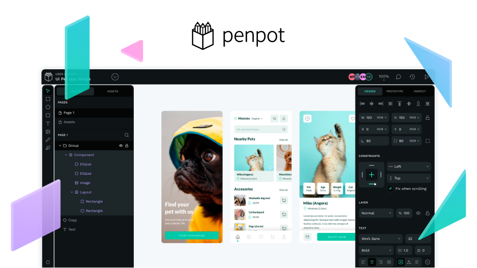
Our team have been rethinking our user interface. From accessibility, how to simplify it to new themes. We are planning to create and add the following themes:
- Light
- Dark
- Dimmed
You can check the stage it is here: Taiga
Also, explore how to allow users to create and add custom themes. Any thoughts? Join the conversation: Thoughts on Penpot’s User Interface
