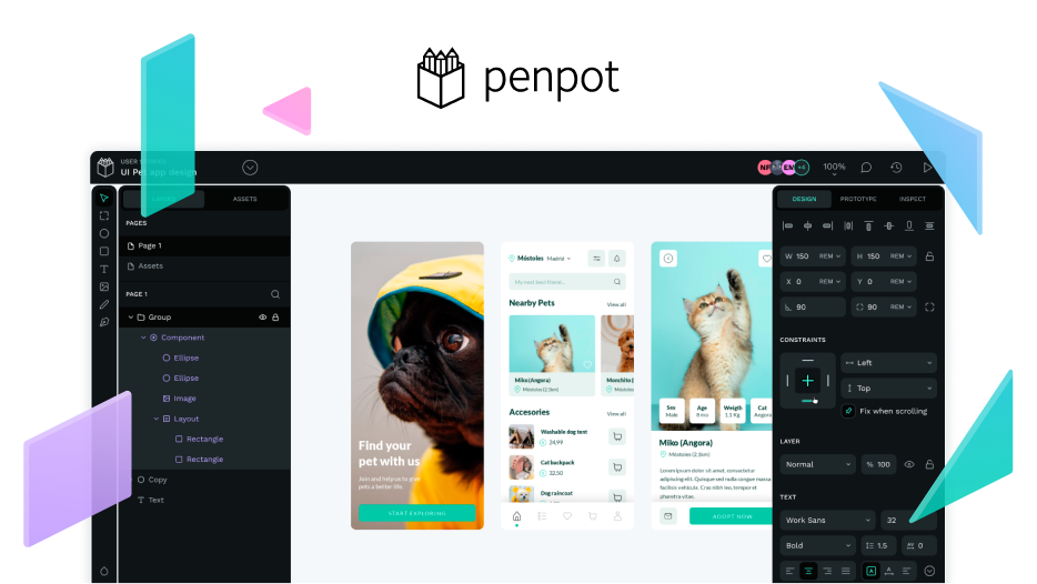
One of the highlights of upcoming Penpot 2.0 is its redesigned user interface.
What does the new UI have in store for you?
1. Simplified space organization and cognitive load reduction
The redesign of Penpot’s new interface focuses on optimizing space management and reducing cognitive load. The interface now shows a cleaner layout with collapsible elements, suitable for those who use different screen resolutions. Whether you prefer a basic list or detailed options, Penpot lets you customize your workspace to be more efficient.
- New toolbar placement
The toolbar has been relocated to the top of the canvas, optimizing space and accessibility. This change makes it easy to get to important functions. Additionally, the toolbar can collapse. This is particularly beneficial when you’re working on complex projects. Enjoy this new design and the use of shortcuts provided to work faster.
- Intuitive panel organization
We’ve introduced dedicated panels to improve organization and reduce cognitive load. When accessing components or tools, you can simplify your view by displaying only the options they need.

For example, when editing a grid, the sidebar dynamically adjusts to show relevant editing options, simplifying the workflow. This helps you work better and stay focused on your work.
2. Light theme integration
Previously, Penpot featured a light theme for the dashboard and a dark theme for the workspace. With the new redesign, we’ve aligned the interface by offering a consistent light theme throughout.
3. Accessibility improvements
Accessibility remains a top priority in our redesign efforts. While there’s still progress to be made, we’ve included significant improvements to enhance accessibility features. This includes adjustments to image sizes, iconography, typography, and keyboard navigation throughout the interface. Making Penpot usable for everyone is one of our goals, and we’ll persist in our efforts to improve accessibility.
The new Penpot UI redesign is a big step in our commitment to making a user-friendly, efficient, and accessible design tool.
Do you have any first thoughts?


