Hello everyone.
Sadly I could not do the project on Penpot since is missing alot of features. Check prototype here.
Penpot doesn’t need to be a Figma layout copycat, and at the moment I feel it is. My improvement is exacly on that point. After using Penpot for some tests, I fell that we - as a community - can make the UX/UI much better and features that Figma doesn’t even have. Let’s start to think outside of the box, instead of playing safe. Only that way we can grow and be a strong tool against Adobe.
Critical:
- Change the font to Source Sans, instead of Work Sans. Personally, one of the worst mainstream fonts from Google Fonts for readability.
Features that I suggest:
-
Penpot icon as a main button: An actual pen pot holds different pens and stuff, so let’s use the real life feature to the software.
-
Windows instead of columns and top bars: It doesn’t consume all the space and for small screens it can be a important feature to have.
-
All tools in the same place: let’s not disperse the tools, make then all in the same place. Using icons can be a simple and efiently way of doing it.
-
Fast Undo and Redo access: for starter users can be important to have right from the start that two tools.

-
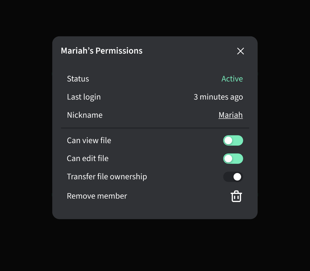
Easy team members management. Check when the member last login and if it is online or not. “Transfer ownership” (admin) feature.
-
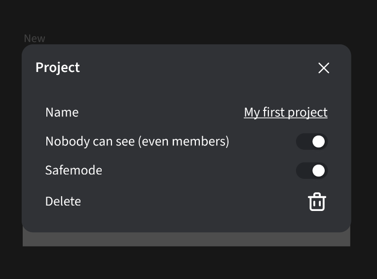
Project management modal. “Nobody can see” feature, that blocks all the users to see the file, while the owner is doing the editting. “Safemode” feature that blocks all the members to view and edit the file.
-
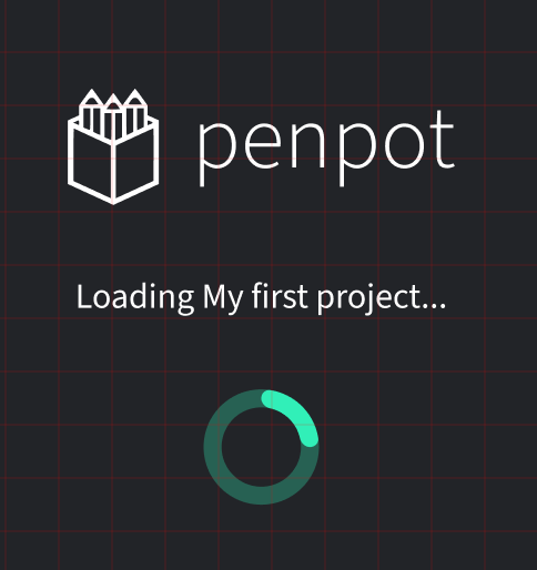
Branded loading screen for when loading the project or the view mode.
-
View mode top bar. Put (again) all the tools in the same place. Easy to know where they are.

-
View mode hightlight bar. Feature that Figma doesn’t have, the possibility to draw in the view mode. Great for teaching or explaining.


Thanks alot for reading. I would love to read your feedback and see different point of views about this.
