
Guess what? Design Tokens make their debut in Penpot!
This 2.6 release is a special one. It is truly exciting to say Penpot is the first design tool with native design tokens support.
Let’s dive in!
Penpot Design Tokens

Design tokens are design building blocks, written in a language shared across tools, disciplines, and tech. They offer a single source of truth for design decisions, acting as a bridge between design and development and helping them collaborate more efficiently.
It feels like it was just yesterday when we announced our partnership with Tokens Studio by Hyma. Together, we’re bringing to life our shared vision of how a design tool should handle design tokens. This release is a key milestone but also just the beginning; we have interesting plans ahead.
Manage brands and themes across design systems

Design Tokens provide capabilities to efficiently manage design assets considering multiple dimensions (brands, devices, color schemes, etc).
Penpot provides token types for the most used properties, like Color, Opacity, Border Radius or Sizing, Spacing, Rotation, and Stroke. More token types are planned for future releases. You can add values to your tokens, including references to other tokens (aliases) and even math operations. And you have Themes and Sets for an efficient way to organize and manage token configurations.
A standard format for Design Tokens

Penpot Design Tokens adopts the Design Tokens Format Module and its definitions, a draft by the W3C DTCG, ensuring maximum compatibility with a wide range of tools and technologies.
Tokens are stored as JSON files. You can import your existing tokens into Penpot, or export them for use anywhere else. Before you ask, we are already working on the synchronization through third parties like GitHub.
Starting with design tokens
Design Tokens are extremely powerful, though they do come with a bit of a learning curve. To start playing with them, we recommend checking out this awesome post by @laurakalbag and keeping the user guide handy for reference.
Comments upgrades
At our last release, we announced significant improvements for comments like mentions and notifications. We also promised (sort of) that you could expect more soon, and here we are.
Comments grouped by zoom level

Comments are now grouped based on your zoom level, giving the right level of visibility and making navigating feedback easier. This makes navigating feedback much smoother, especially in complex designs with lots of discussion.
Mark all comments as read

Clearing comment notifications on the Dashboard used to be a bit of a hassle. Since this release, with the “Mark all as read” button you are just one click away from a clean state in this area.
Libraries & Templates carousel refinement
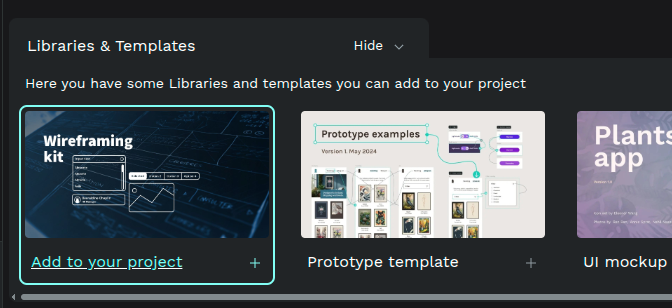
We’ve fine-tuned the Libraries & Templates carousel to better separate it from your project files and to give clearer feedback on how you can use them.
Export WebP images

WebP format is already supported at Penpot exports. This one technically dropped just before 2.6, but it definitely deserves a shout-out. Huge thanks to @dfelinto for this (another) awesome contribution!
Our team especially loves it since most of the images in the Penpot user guide are in this format, and now we can generate them without that extra annoying step. To be honest, it feels a bit embarrassing that we didn’t add this ourselves long ago 
Only way out 
Fun fact: The release title is this song chosen by ascpixi, the 19 year old Hack Clubber who won the Penpot prize for High Seas. He built Vestige, a supercool online modular synthesizer. The lyrics are about getting someone out of a tough spot, though you might find your own interpretation.
These are the highlights. As usual, we’ve also tackled improvements, bug fixes and optimizations. Check out our Dev Diaries for the details.
We’d really like to hear what you think about this update!
