
Penpot 2.12 continues to reinforce our vision of a product that grows iteratively, incrementally, and always grounded in real user needs. The improvements to tokens and variants are perfect examples of this approach: we release versions that address users’ needs in an essential, meaningful way first, and then we continue evolving them continuously. These updates also connect directly to the Tokens Evolution Plan we published in May, a path we are actively delivering on.
The enhancement to PDF export is another clear illustration of how Penpot is shaped. This idea wouldn’t have emerged without direct conversations with companies migrating to Penpot. It’s genuinely fascinating to discover the variety of workflows that exist out there, and how each team brings new insights that help us make Penpot more flexible, more precise, and better aligned with real work.
This release is made of exactly that: thoughtful improvements inspired by feedback, real use cases, and community collaboration.
Apply color tokens right from the sidebar
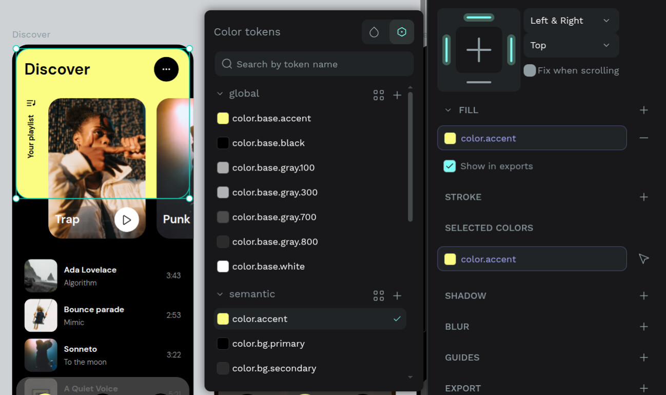
Design systems should be both powerful and effortless to use. This release brings design tokens closer to where you work, making them easier to apply and easier to understand**.** Your color tokens now appear directly in the properties sidebar, making it faster to apply or unapply tokens from the design tab. No more digging: now you can use tokens within your design flow.
In the next releases, we’re going to implement that visibility capability for other properties (size, opacity…). Stay tuned!
See applied design tokens directly in the inspect panel
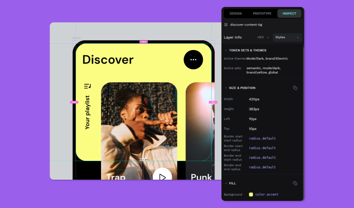
To bring more clarity into the design process, the Inspect tab now shows which design tokens or styles are applied to each element (similar to how style information is already displayed).
A new Styles panel highlights design tokens and styles first, while the previous “Info” panel is now called Computed. A simple dropdown lets you switch between Styles, Computed, and Code, making the Inspect tab easier to navigate.
You can also pick your preferred color format (HEX, RGBA, HSLA) through a unified selector that appears across all Inspect views.
When an element uses a design token, the token name appears as the property value, with quick actions on hover to copy the design token or preview its resolved value. Sections are still grouped and now fully collapsible, and we’ve added a small area displaying active themes and sets for extra context.
This update makes Inspect mode clearer, more informative, and better aligned with real design workflows.
Simpler boolean variants
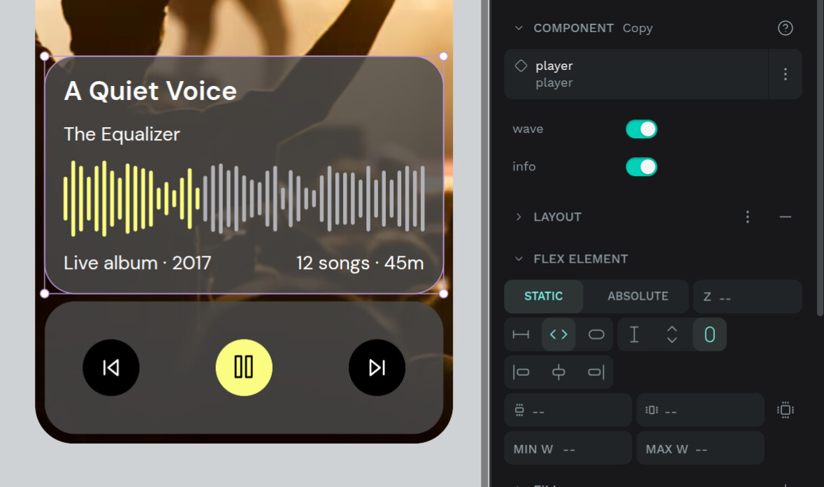
Variants are crucial for building flexible, scalable design systems. With this release, boolean properties have become significantly easier to work with. Again, reflecting our iterative, incremental way of improving the component system.
Binary states now use a clean toggle to be able to switch visually, instead of a dropdown. This makes adjusting component states more intuitive and speeds up working with multiple instances.
It’s a subtle improvement, but it removes the friction you feel hundreds of times a week, and makes component work flow more naturally.
A small improvement with big impact: less friction, more flow.
Smarter PDF export

Exporting your work is now more precise and aligned with how teams actually share and communicate.
Choose exactly which boards go into your PDF
You’re now fully in control of which boards are included in your export. Share only final screens, a specific flow, workshop materials, or anything else you need. This new export flow adapts to real-world workflows, letting you tell the story you want to tell with exactly the boards you need.
This feature came directly from conversations with teams migrating to Penpot. These discussions revealed workflows we hadn’t encountered before, highlighting how diverse real design processes can be, and how essential flexible export options are in those contexts.
It’s another example of how Penpot evolves through real, lived user needs.
Cloud single sign-on
From now on, single sing-on is available on the browser, not just in self-host instances. This makes accessing Penpot easier, faster, and more secure across your organization, ensuring consistent authentication no matter where your team works.
Drop zoom snap

What makes this enhancement especially meaningful is that it comes directly from a community contribution by @Tokytome.
With this update, Penpot removes the old “zoom snap” behaviour to ensure that pixel-grid snapping works consistently at every zoom level. Previously, snapping to the pixel grid would stop working below a certain zoom threshold, leading to misaligned shapes or unexpected positioning at lower zooms. This improvement restores reliable, predictable snapping that aligns with how professional design tools handle pixel precision, making the design experience smoother and more accurate.
Penpot grows through the real needs, insights and requests of its users, but also direct contributions. This fix is a great example of how community-driven improvements raise the quality of the product for everyone. Each contribution, big or small, strengthens Penpot’s ecosystem and helps shape a tool that is truly built with and for its users.
A more accessible and clearer User Guide

Alongside this release, we’ve reorganised the structure of the User Guide to make documentation easier to navigate. Sections have been restructured for clarity, allowing you to find what you need faster, whether learning Penpot basics, exploring advanced features, or checking how to integrate workflows.
Want to know more?
Want to dive into every fix, improvement, and detail included in this release? You can find the full Penpot changelog here.
 The holiday gifts have come early!
