
Fresh from the momentum of our last release, Penpot 2.9 lands with significant progress in design tokens management (say hi to our very first typography token!), smarter text overrides for components, and a rich collection of quality-of-life enhancements.
Let’s dive in 
Design Tokens: Font size token and more
We keep evolving Design Tokens continuously in Penpot:
New typography token: Font Size
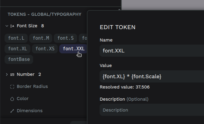
Say hello to the first of many typography tokens. Font Size is now available as a Design Token, and you can expect many more soon (font weight is coming next!).
Import token sets via .zip
Managing multiple token sets just got easier. Drop in a .zip file to import your entire collection in one go.
Smarter token targeting
Tokens now can be applied only when they make sense. Border radius? Only for shapes and layouts. Font size? Just for text layers. Spacing tokens (gaps, padding, etc.)? Only within layout containers.
Improved text resizing

-
Double-click text box edges to toggle between auto-width and auto-height.
-
Smarter resizing: horizontal drags switch to auto-height, vertical ones switch to fixed, as it is expected.
More Quality-of-Life enhancements
Penpot 2.9 includes a stack of subtle but meaningful improvements that make everything feel a bit snappier and smarter:
-
Improved dashboard sidebar with groups that would help to differentiate projects from sources (Fonts and Libraries).
-
New comment indicator in the design workspace that well alert when feedback arrives.
-
“Save color” for assets is now a primary button, improving its discoverability.
-
Bounding boxes hide automatically when editing visual effects. This was already happening in some design properties and we’ve added it to the rest.
Under the hood
As always, we’ve crushed bugs, tuned performance, and cleaned up the pipes to keep everything running fast and smooth. If you’re really curious about it, here’s the changelog with the complete list.
