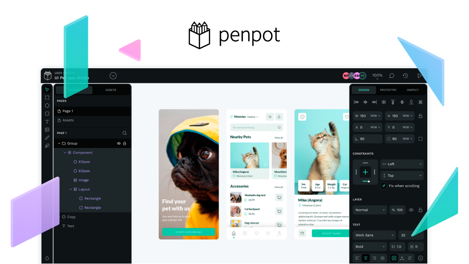
I just finished my first UI Design System using Penpot, and I’m super satisfied with its features! While using it, I noticed a few small things that I think would make the experience even smoother if they could be optimized. Here they are:
-
When editing vector graphics, the node positions can’t be precisely controlled by X and Y values right now (this would be really helpful for creating detailed icons);
-
For linear gradient fills on shapes, it seems like we can only choose horizontal or vertical directions—there’s no way to adjust the angle freely;
-
When filling colors for graphics, we can’t directly select Color tokens from the colorpicker panel;
-
When adding inner shadows to rounded shapes, if you set the “Blur” value to 0, there will be slight jagged edges on the shadows around the rounded corners.
Honestly, Penpot is such a useful design tool—I really hope it keeps getting better and better in the future! Also, wish the team all the best in bringing more surprises and benefiting more designers along the way~