In this release we introduce what’s (probably) the top community request: Variants are a powerful way to bring order and flexibility to your design system in Penpot.
On top of that, Design Tokens now include more typography token types, plus the usual series of quality-of-life improvements.
Let’s dive in 
Note: Docker images are published shortly after the SaaS update: Why do self hosted versions lag behind new releases?
Variants are finally here

With Variants, you can group similar components (such as buttons, icons, or toggles) into a single, customizable component. An example would be a single button that can switch between primary, secondary, active, disabled, small, and big (or any other desired setting) without disrupting your workflow. Want more details? In the user guide, you’ll find a video demo and how to use them.
If you want to get an existing design file with components to use variants, you’ll find priceless advice in this clarifying post by @miryamgduque: How to prepare your files for the upcoming Variants release.
Huge shoutout to our community for the ideas and feedback that made Penpot Variants real, so much of it came from the beta test 
New typography token types
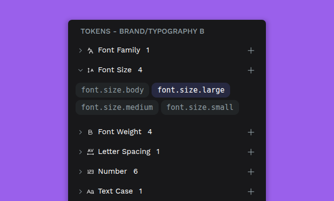
No more, no less than six new token types, significantly boosting your ability to manage design decisions, particularly in typography: Font Family, Font Weight, Text Case, Text Decoration, Letter Spacing token, and Number token (for unitless values).
We’re continually building on Penpot’s native Design Tokens support. These tokens for single properties are in the critical path for something that we are already working on: a composite token to rule all the typography tokens.
Select your board size upfront

Now you can choose a board preset size before you begin, so you can start without needing to draw a board with a random size first.
Show distances while moving layers

You can now see distances between elements while moving them. Move a selected element with the arrow keys while holding Alt (or Option), and as you do, you’ll see the distance to whatever’s under your cursor.
Want more details?
If you’re really curious about it, here’s the changelog with the complete list of changes, including enhancements, config adjustments and bugfixes.
