Hi There,
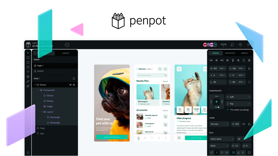
on my screen it’s really hard to see the tools, and the various menu’s. Could we improve the contrast on the menu’s. I’ve been playing around with the tool a bit and tried to recreate the menu, and change the colors just to get a sense of making penpot better using penpot (very meta).
My sense is that we should get a method to make themes for Penpot. That allows us to create high contrast menu’s.
Cheers.
1 Like
Our team have been rethinking our user interface. From accessibility, how to simplify it to new themes. We are planning to create and add the following themes:
You can check the stage it is here: Taiga
Also, explore how to allow users to create and add custom themes. Any thoughts? Join the conversation: Thoughts on Penpot’s User Interface
1 Like
I feel that a higher contrast version would be useful. It can be done tastefully. For people like me with a poor screen, or visually impaired individuals higher contrast can be a life saver, but also a quality of life issue.
4 Likes
Please please please work on this feature, I have astigmatism and dark interfaces gives me headaches please please please I wanna stop using Figma
Hello @Aragubas we are working on something you may like
Here is a little sneak peek of it.
Layers section
Assets section

Toolbar

These areas may change a little bit while working on them. 
4 Likes


