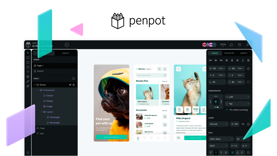
I’m a senior designer mainly doing UX/UI and service design. I work for a mid size (~250 employees) IT consultancy company. I’m currently using Figma as my main work tool, but I spend couple of days end of last year to test Penpot and share the findings with my designer colleagues. While doing that, I thought that why not share the same things here for everyone to see.
I think while Figma is working very well, they are moving towards the direction where the goal is to just increase the license pricing while not providing too much value for that price increase. Also the UI is getting cluttered and to me it looks like that they just have different teams working on different features without too much alignment.
This has taken me here and to try out Penpot and see where it is currently. I have tried it previously like a year ago or something, and at that time it was not suitable for my workflow. So here are my thoughts:
Negatives:
- Currently the feature set is super limited when compared to Figma, meaning that it is not a suitable alternative as is imo. Biggest missing feature is component variants, which makes a huge impact in terms of how components are build as well as makes it closer to how it is done in code. For me this is the biggest blocker, as I maintain hundreds of components and work on creating new as well as editing current ones on daily basis.
- Similar can be said about work flow which is pretty bad compared to Figma. Overall updating the design tokens is pretty slow and the current UI makes this somewhat hard. Same applies for using these tokens in the design work and within components. While Figma’s latest variables is still a mess, it is still a big step forward in terms of token handling.
- Desktop app is missing, making some keyboard shortcuts a missed opportunity. I encountered some performance issues in Chrome as well, but it seemed to be only brief. But sometimes it can get pretty bad, making it unpleasant to work in Penpot.
Positives:
- Penpot has created the autolayout feature on top of CSS flexbox, meaning that it works exactly the same as in code. This makes it easier to make implement the responsiveness in the design as well as implementing that in the code based on the design spec. I think for the first time the CSS code part might be somewhat usable as is.
- Penpot is open source and free, which aims to be the case also in the future. Figma costs tens of thousands on yearly basis for a company of our size (~30 active users, mostly designers) and the price will increase in the future when Figma releases its new feature pricing. I think it is ok to pay for tools that you need for work, and I would be willing to pay for Penpot as well if that would be the case, but it all comes down to the value and how it fits the workflow and needs of the users.
- Penpot can be self-hosted for example with Docker. This gives more control for security aspects etc. Many of our customers are pretty interested in this kind of a model.
- Penpot supports webhooks for integrating it to other services. I did not test this, but it would be nice to give it a test with some developers when the release 2.0 is out.
Next release 2.0 is around the corner, which will introduce a lot of good changes including CSS Grid, which should make it pretty easy to create more responsive and scalable designs as well as translating that into code. I will revisit the tool when the 2.0 is released, even though I assume that the tool is not ready until the component variant feature is out.
Thanks for all the work you have been and are currently doing! Great work, keep it up!
Br.
Jesse
