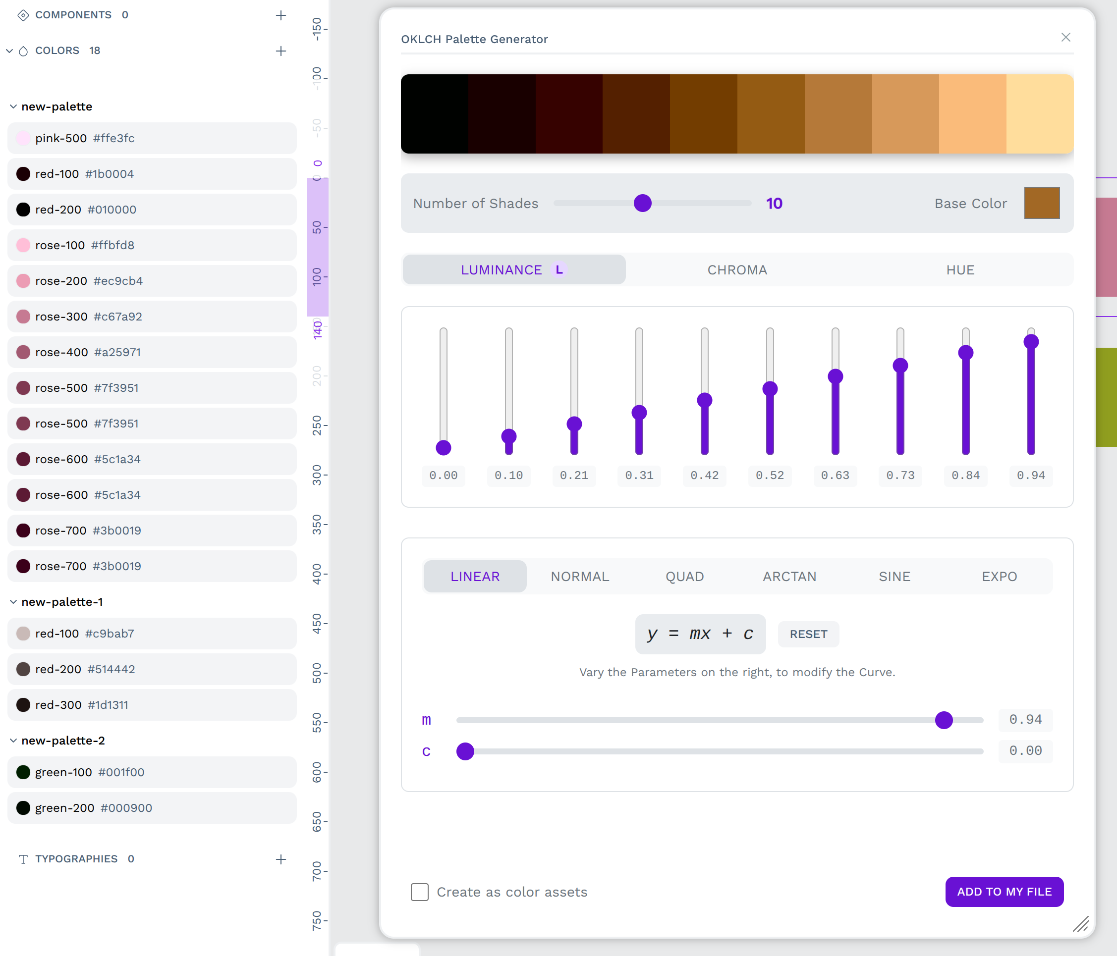
I’m excited to share my latest plugin: OKLCH-Palette, a plugin for Penpot that helps you generate perceptually uniform and accessible color palettes using the OKLCH color space.
Picks the base color from your selected object or lets you pick one yourself
Uses OKLCH color space, so your palettes feel more natural instead of random RGB magic
Offers multiple generation curves: Linear, Sine, Quadratic, Arctangent, Exponential… you name it
Lets you adjust parameters in real time and manually tweak lightness via sliders
Works in separate tabs for Lightness, Chroma, and Hue
Drops color rectangles directly into your canvas (if you want), and can even add them to your color library
Why OKLCH?
Because it’s perceptually uniform, which basically means color steps look evenly spaced to our eyes, unlike typical RGB or HSL-based palettes. More accessible, more elegant.
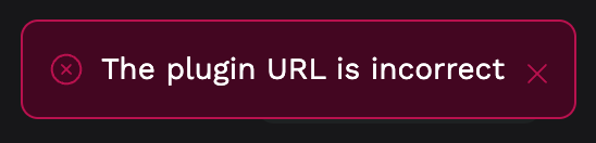
I think there’s an issue with the URLs in the Install in Penpot.app and and Copy install URL buttons. Looks like they’re http:// not https:// and this causes an error in Penpot if you try to install from those buttons.
@juan.delacruz it’s so good! I love that it creates a sensible scale regardless of what base colour you through at it, and being able to tweak either the curve or the individual values is sooo helpful.
A couple of things that confused me slightly. The text that says “Vary the Parameters on the right, to modify the Curve”… the parameters/sliders are below the text not on the right? Also the proximity of the reset button to the formula made me think that you could make changes to the formula (like I’d know what I was doing there anyway ) rather than resetting the values I had adjusted with the slider. Does that make sense?
Thank you for this fabulous plugin! Previously I was using GitHub’s old Primer Prism tool to generate palettes like this, and now I can do it without leaving Penpot And it pairs perfectly with the Color Styles to JSON file plugin for design tokens goodness.
This plugin is wonderful!
As I discussed with LauraKalbag and don, I’m always very (too much!) concerned about color management (a professional flaw as a graphic designer!) and I’d like to know how the gamut clipper works. Does it warn you when a color is out of gamut or does it approximate the closest color the monitor can display (which is actually what the browser itself should do automatically, if I’m not mistaken)?
Sorry for the curiosity and thanks for your work!
The plugin approximates the closest color that the monitor can display within the standard sRGB gamut. It does not currently have a visual warning for out-of-gamut colors, though that’s an excellent idea for a future update.
The plugin is built on the OKLCH color space, which is capable of describing colors that are far more vibrant than what most screens can actually show (i.e., colors outside the sRGB gamut). This is where the “clipping” process becomes essential.
The Engine: Under the hood, the plugin uses a color science library called culori.js. This library does all the heavy lifting for color conversions.
The Process: When you use the formulas or sliders to create a color, you might define a color in OKLCH that is, for example, an extremely vibrant “electric” blue. When the plugin needs to provide a standard HEX code for Penpot and the browser to use, it asks culori.js to convert that OKLCH color to sRGB.
Perceptual Mapping: The library detects that the “electric” blue is outside the sRGB color space. Instead of just failing or picking a random color, it performs a process called gamut mapping. It finds the color on the absolute “edge” of the sRGB gamut that is perceptually closest to the original color you defined. It’s very smart about this, trying to preserve the hue and lightness as much as possible while reducing the chroma (vibrancy) until it just fits inside the displayable range.
You are absolutely correct about the browser! Modern browsers, as defined by the CSS Color Module 4 specification, perform this exact same gamut clipping process automatically when they encounter a color defined in a larger color space (like display-p3).
By doing the conversion within the plugin before generating the final HEX code, we ensure that what you see in the plugin’s preview is exactly what you’ll get in your Penpot design and in the final web output. We are essentially “pre-rendering” the color into a safe, predictable sRGB value for you.
The behavior you’re seeing is intentional and is linked to how the plugin generates the color scale.
The plugin creates the color scale by generating a smooth transition between a start point (From) and an end point (To) for a given property (like Luminance). Your “color-500” shade is calculated as the exact mathematical midpoint of that transition.
So, the reason your original base color isn’t landing exactly on the “500” spot is likely because the From and To values you’ve set aren’t perfectly symmetrical around your base color’s original value.
For example, if your base color has a Luminance of 0.65, but you set the range to go from From: 0.90 to To: 0.20, the mathematical midpoint of the scale will be 0.55, not your original 0.65.
Perhaps you could try a “Symmetrical Approach“ (works best with the Linear easing curve).
Select your object and note the original value of the property you are editing. Let’s say its Luminance is 0.72.
Decide how much you want the scale to extend in each direction. For example, you want to vary it by 0.30.
Set your From and To values symmetrically around your base value:
Set From to 1.00 (0.72 + 0.28, capped at 1.0).
Set To to 0.42 (0.72 - 0.30).
This creates a balanced scale where the mathematical center is guaranteed to be exactly your starting value of 0.72.
Let me know if that method works for you! Either way, I’ll make a note of your feedback to explore it as a future improvement