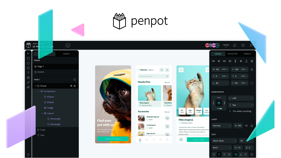
Create prototypes for websites and web apps that adapt to various screen resolutions for desktop and mobile devices. The UI elements on your screens will also adapt automatically.
The prototyping tool could use flex display techniques for the responsive elements when necessary, using a layout responsiveness function, similar to Figma’s auto layout, but adding other resolution options like percentage (%) as shown in the video below and a line break option in case the artboard is reduced and the space of the element group becomes larger than the size of the artboard, an example is the unofficial Figma auto layout plugin.
Images in Issue on Penpot GitHub: Responsive prototyping · Issue #2330 · penpot/penpot · GitHub
