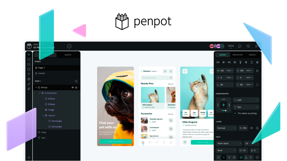
As it’s often the case with major releases, they feel both like the end of a journey and the beginning of a new one.
Short clip showing all
Let me first cover why Penpot 2.0 is such an impactful release.
Once again, we delivered on our promise to bring developers and designers closer together. Our bold movement to build CSS Grid Layout and enable designers to create responsive interfaces matching coding constructs was unexpected. The design tool space has changed forever.
Component Libraries have been revamped with a new data structure to help designers and large teams build extensive design systems more modularly. The addition of component swapping as well as more flexible categorisation options provide a significant boost in productivity.
We rebuilt the entire Penpot’s UI to be sleeker, faster and more beautiful. This will be obvious to everyone that used Penpot in the past but equally mesmerising to newcomers. Streamlining user experience means allowing for more time spent creating and collaborating at scale, which sits at the core of Penpot’s mission.
Penpot 2.0 showing an interactive prototype
Each of these features, on its own, would have deserved a major release and yet we have another three major updates.
- You can now use images as a fill property.
- We added HTML generation on top of CSS and SVG.
- UI theming is now a reality, starting with Light & Dark.
Dark or Light themes, we love both!
If you want to know all the details of what comes packed with 2.0, including performance improvements and 40+ changes not covered here, head to our Dev Diaries page.
It took the team 9 months to build and ship this amazing release. We didn’t want to cut corners, we wanted to be proud of our work so you could team up and collaborate around design and code projects with no limitations or compromises.
We are building our own path where concepts such as declarative design, future-proof ownership of your work and a no-handoff mindset meet long-standing pragmatic design and coding practices.
Our SaaS service at design.penpot.app was the first to roll-out 2.0 a couple of days ago and self-host images will follow very soon. We will always make sure that, no matter your choice, Penpot delivers the same experience.
Design-as-code is a reality with Penpot
What’s next?
Delivering Penpot 2.0 required the product team to act almost as a sole entity so interdependencies between new features would not create bottlenecks.
Post 2.0 we are shifting to an “initiatives” approach where smaller autonomous teams can ship upgrades independently. “Design tokens”, “Plugin architecture”, “AI” or “E2E testing framework” are some of them.
Do you want to know everything about Penpot 2.0 and what we’re cooking up next? Do you want to learn from amazing designers and developers that are shaping the industry by driving collaboration forward? Do you want to enjoy our very own PenpotFest in Barcelona, 5-7th June? Make sure to get your early bird tickets while they’re still available!


