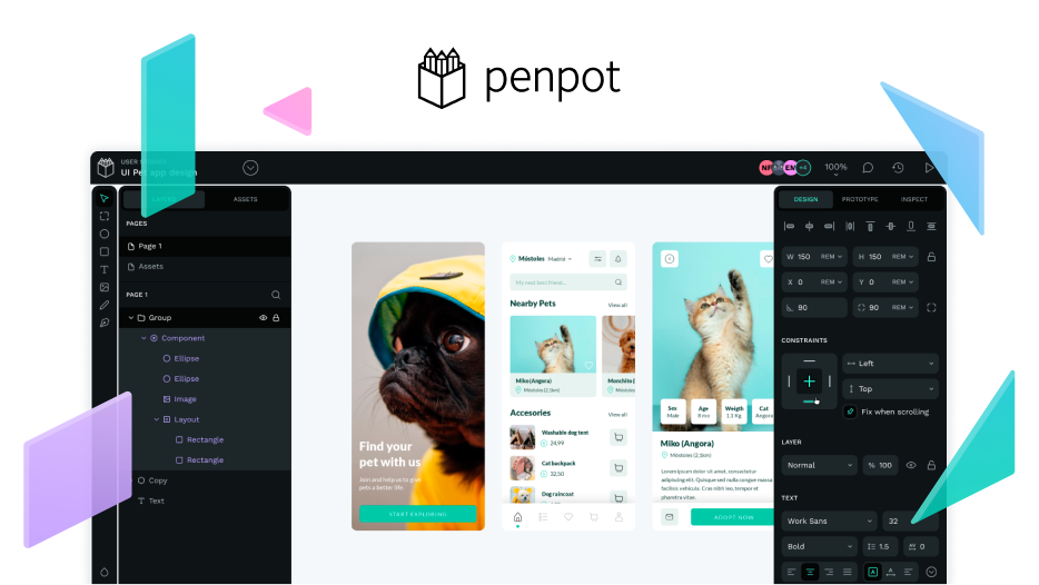
Penpot 2.0 is nearly ready! And we’re excited to share a preview of Penpot’s new components.
Scale up your design across your teams, projects and files
This massive upgrade brings more consistency, efficiency and scalability to your Penpot projects. Thanks to the new component library, you can avoid manual changes. You’ll be able to reuse design elements across multiple projects, speed up the design process and keep the overall design consistent.
(Brand New Components - Penpot 2.0 sneak peek Demo by @diacritica )
Of course, this will have an impact on scalability. When you’re working on big projects, components help build applications in a way that’s easy to scale, allowing you to create solutions that can adapt and grow with your projects.
The expected advantages of the new Components System, including improved control over instance inheritance and overrides, instant synchronization for updated overflow, and extra features like swap or annotations, will drive increased consistency and efficiency.
Take a closer look at what the Components System brings forth.
Main component physical representation
From now on, you’ll be able to visualize a Main Component. It’ll have a physical representation in your workspace, your layers and your assets. When making changes in the main component, these are propagated instantly to the other components.

Accelerate your processes with Swap
When designing interfaces, we often shift between different instances of these components for various elements. The solution? Just a click away: Swap!
Swap is a key feature when designing complex projects because it allows you to exchange instances or variants in the existing file with instances from a different library. You don’t need to create multiple versions of your parent component. You can choose which values or elements can be swapped with your selected instance.

Annotation option
Annotations are embedded in each component, to let you leave notes on any component within the project. These annotations will consistently be tied to the specific component and will be visible to all members of the project. Use this functionality to write relevant information for yourself or your team.
Specific Components System capabilities
1. More control over changes:
- Granular versioning: Easily track and undo modifications at the component level.
- Selective propagation: Choose whether changes apply everywhere or only in specific instances.
- Dependency management: Smartly handle dependencies and get alerts about potential conflicts.
2. Single Source of Truth:
- Centralized repository: Keep all components in one place for consistency.
- Global access and updates: Access and update components globally to prevent confusion and ensure everyone uses the latest versions.
- Version history: Maintain a detailed record of changes for each component.
3. Component Relationships:
- Parent-child relationships: Changes in parent components reflect in child components while allowing for overrides.
- Nested components: Effectively manage changes in nested components for consistency and control.
4. Collaboration and communication:
- Real-time collaboration: Work simultaneously on the same component.
- Notifications and alerts: Stay informed about changes to components, allowing designers to adapt their work accordingly.
(New Components System demo by @myfunnyandy, Penpot Product Owner, at the Creative Freedom Summit)
You’ve been waiting for this for a while and it’ll be out very soon. Time to start using Penpot and give it a try to the new Components.


