Have you had the chance to try the Flex Layout for your projects? How about the other recently released features like absolute positioning, smart spacing, z-index management and wrap property?
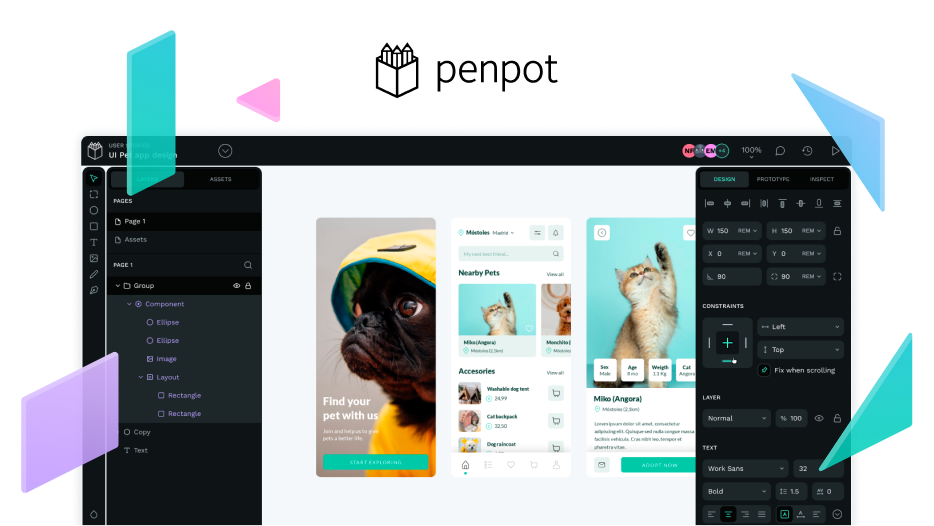
A screenshot of our playground template where you can learn more about Flex Layout
As a brief refresher, for those who may not be familiar with Flex Layout yet, this is one of Penpot’s most requested features and a totally turning point in design and product development.
With Flex Layout, designers can create layouts that seamlessly translate into web pages through dynamic CSS flexbox web standards. It’s an incredibly powerful layout feature that helps improve the designer-coder collaboration, and that’s what Penpot is all about, right? In fact, the whole process of developing it showed the spirit of collective effort that’s behind open source, with the community proposing alternatives to have a layout system, the team looking for a solution, and a group of skilled contributors providing incredibly valuable feedback to finally create the key tool that everyone can enjoy today.
It’s been running for a few weeks since its release and we wanted to make sure that everyone was properly updated on the latest properties.
-
“Let’s create a page that gathers all the information related to Flex Layout and complementary features”, we said.
-
And Clara, designer at Penpot added: “It would be really cool to actually have a playground to avoid facing the blank page and be given an overview of the new feature”.
So we got down to work.
We created this video to double-check that no one misses out on enjoying the Flex Layout.
Those who knew about this game-changer functionality but haven’t taken the leap to try it, and those who just learned about it, now have the opportunity to test its potential thanks to the template made by Runroom that we called playground.
This template is included in the new webpage, focused on anything to do with Penpot’s layout features, with loads of information such as: tutorials, documentation, related properties, etc.
But wait, there’s more! You may have seen in previous posts how excited we are about the arrival of Grid Layout. This upcoming feature makes your dimensions perfect when getting designs code ready and we’ll be revealing all about it during the Penpot Fest, the first design-centric conference for the whole community that will take place on 28-30 June in Barcelona. You shouldn’t miss the event of the year!
If you are a designer or developer whose mind has been blown away ![]() by Flex Layout, test the template you’ll find on our layout page and feel free to share your own template or your feedback with the community—it will be super helpful for us.
by Flex Layout, test the template you’ll find on our layout page and feel free to share your own template or your feedback with the community—it will be super helpful for us.


