Hi Penpot team! First of all, thank you for the amazing work on this open-source tool — I really enjoy using it!
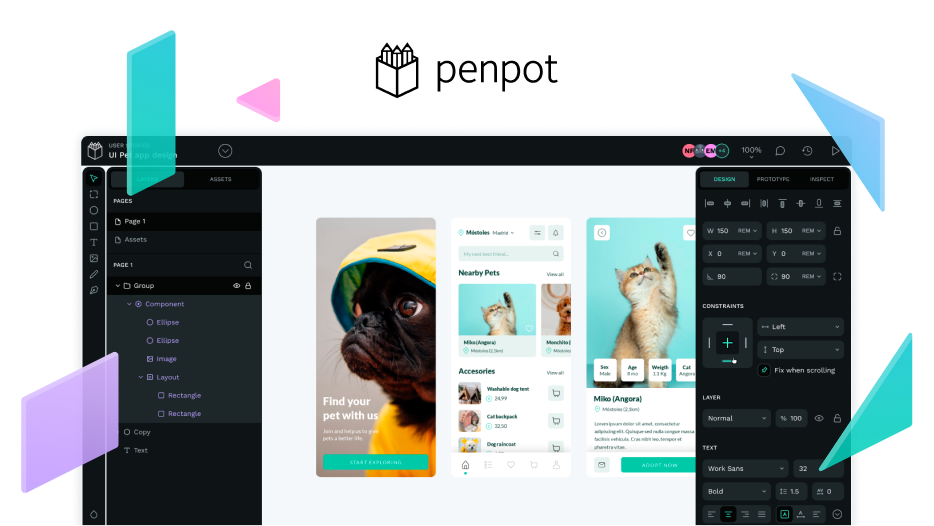
I’d like to suggest an improvement regarding the visibility of the distance measurement labels that appear when holding the Alt key to check spacing between elements.
Currently, the small pink labels are very hard to read in many situations, especially:
When working with light backgrounds
When zoomed in (they stay the same size)
When there’s overlapping or busy UI
It would be great if these measurements could:
Scale slightly with zoom for better readability
Have an outline or background for contrast
Or allow a dark mode override to make them easier to see
This small change would really improve accessibility and usability for many users.
Thanks again for your awesome work!
Best regards,
[A user from Brazil]
