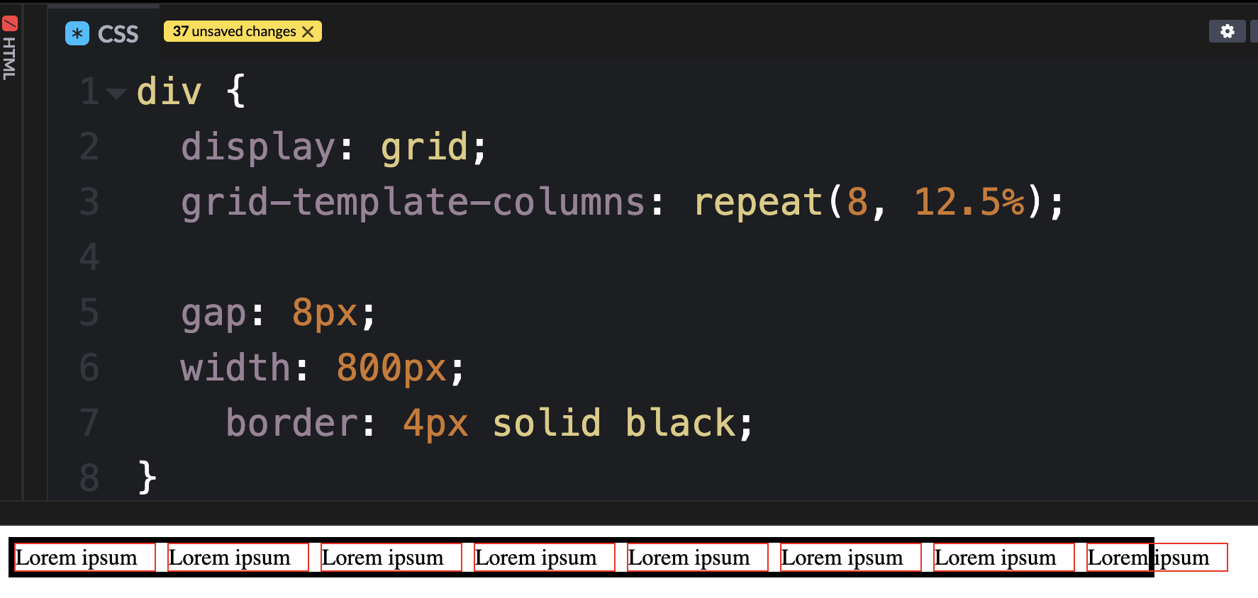
Percentage-based grid columns render pixel-perfect if there is no gap configured. Once gap values are specified, it triggers grid cells to overflow the parent element’s boundaries on the horizontal axis.
Is there some special set of coordinated configuration I’m overlooking to keep grid bounding boxes constrained to their parent element’s bounding box on both axes or is this possibly a bug?
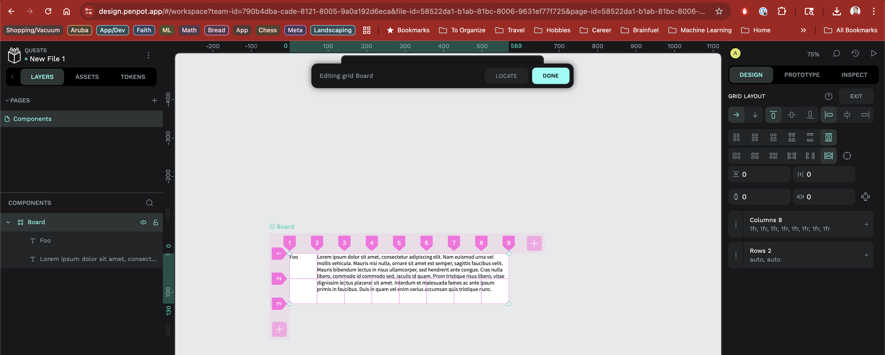
The fractional unit approach appears to work better for constraining the bounding boxes of child elements to the parent’s box. But this approach also appears to have its own problem by not distributing the width of the grid evenly across all the grid columns.
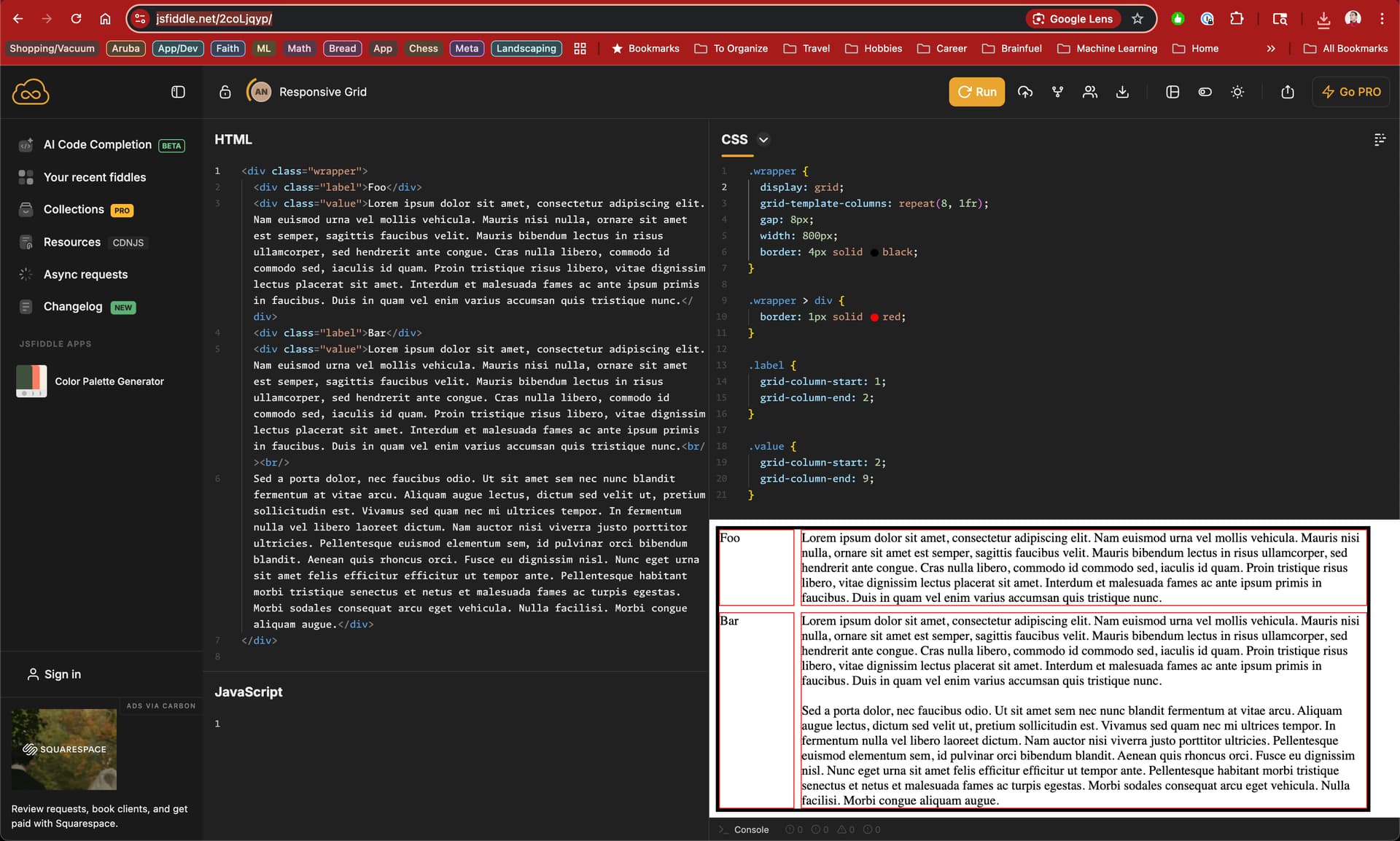
I would expect a simple CSS grid with the same configuration to evenly distribute the total grid width evenly across all columns, as seen in this JSFiddle.
Any way to (1) constrain grid cell bounding boxes to the parent grid element or (2) evenly distribute grid width across all grid cells when using the same fractional width for each?
Considering all the info you’ve just added I would just make it “auto” for everyone I don’t want to set a specific size for. Usually leaving it in auto will take the remaining space, if there’s more elements with auto, it will distribute evenly between them.
That’s just how CSS behaves. When you set up 8 columns that are each 12.5 percent wide, you’re already filling the entire width of the container. If you then add a gap between those columns, there’s no extra space left to fit it in, so the layout overflows.
To avoid this, you can either reduce the width of each column a little or adjust the container to give that gap some room. It’s a normal behavior, not something broken.
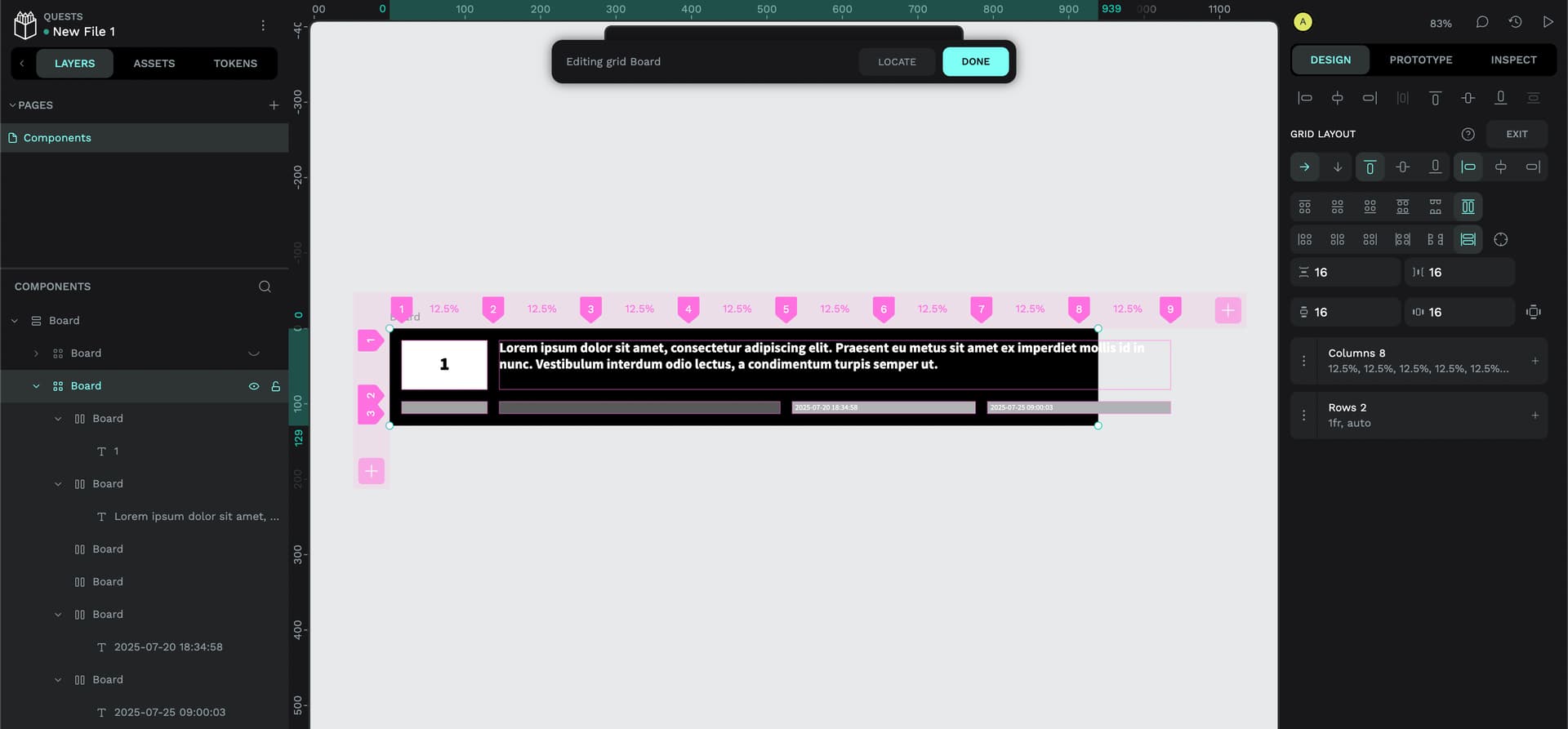
I am able to satisfy my first goal of equal width columns that resize with the parent container. However, the grid rows do not resize to fit the height of the tallest grid cell; instead, the text content overflows the grid cell boundaries, as seen in the screenshot above.
Anything obvious I’m missing here?
Happy to share an export of my file if anyone’s curious or able to take a closer look here. I’ve attempted to upload an export with this post but it appears I’m still too new to the forums for that ability.
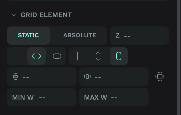
These determine how your text behaves inside the grid, which in turn can affect your grid layout. You should be able to achieve what you’re looking for by setting the grid element to the settings above where the text fills the available width, and is set to the height of its contents.
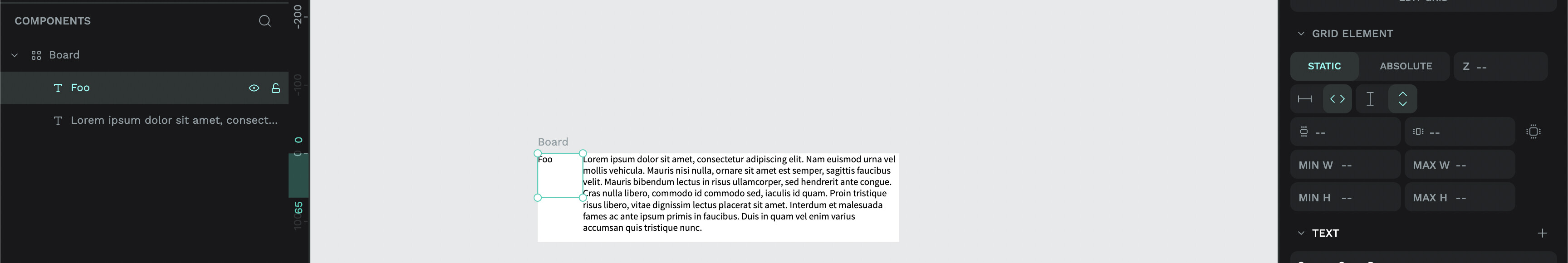
As seen from the screenshot in my earlier post, the composition of my file is a parent Board with a grid layout that contains two text elements: “Foo” and “Lorem ipsum…”.
Unfortunately, neither appear to offer the “Fit content (Vertical)” option from your screenshot.
I have also tried a variation where I wrapped the text elements in a Board with a flex layout. The intermediate Board elements did offer a “Fit content (Vertical)” option but setting it didn’t address the overflow problem from my original problem statement.
Did I misunderstand anything or is there anything else I can try?
Hope this works for you @arris . As far as I understood, you wanted your board to grow whenever your content (text) grows, and you also wanted your cells to keep inside the limits of the board. In this video I cover both things, just in case.