I’m trying to set up a table, and the grid layout seems fine for this, but I can’t achieve what I want to do:
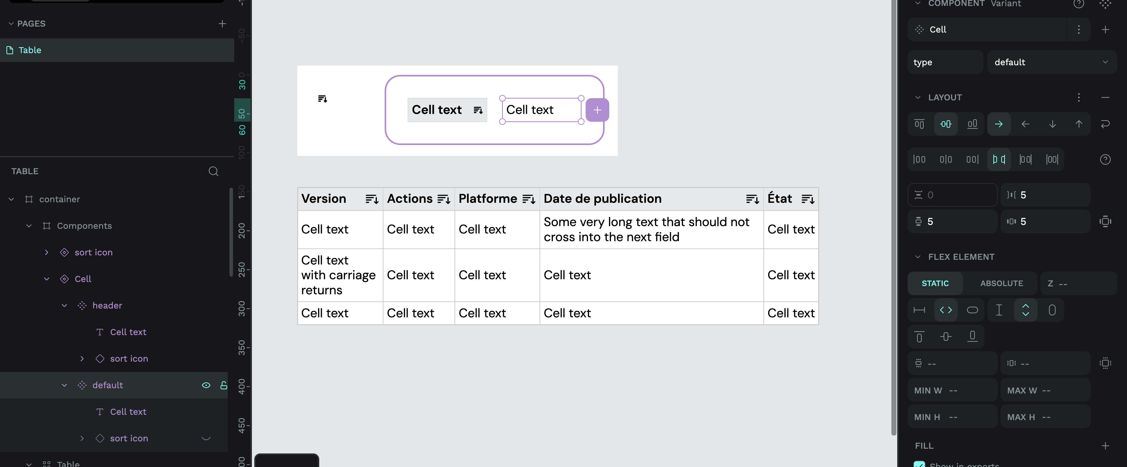
The cells content is a component (text + icon like “sort column”)
The cell must grow if the text in the component is larger than the cell
I need a 1px row for my border (can’t we add a bg color on one row or cell individually?)
I thought grid layout could help me but I’m on it for hours, and there is always something off, like the text in the component not “pushing” the cell, or when it worked, the 1px row stays in place despite the “auto” setting of the cell above.
The cell uses a flex layout so it can fill the height and width of the container. The content is vertically centred and uses justify content space-between to make sure the text stays aligned to the left while the icon will stick to the right side.
2: The cell layout itself is set to fill height and fill width. This ensures the text stays aligned correctly in the grid, regardless of the size of other cells. It also helps the borders stick to the outside of the cell. (Each cell has a 0.5 stroke to make a combined 1px border between cells.) And the background colour to fill the whole cell.
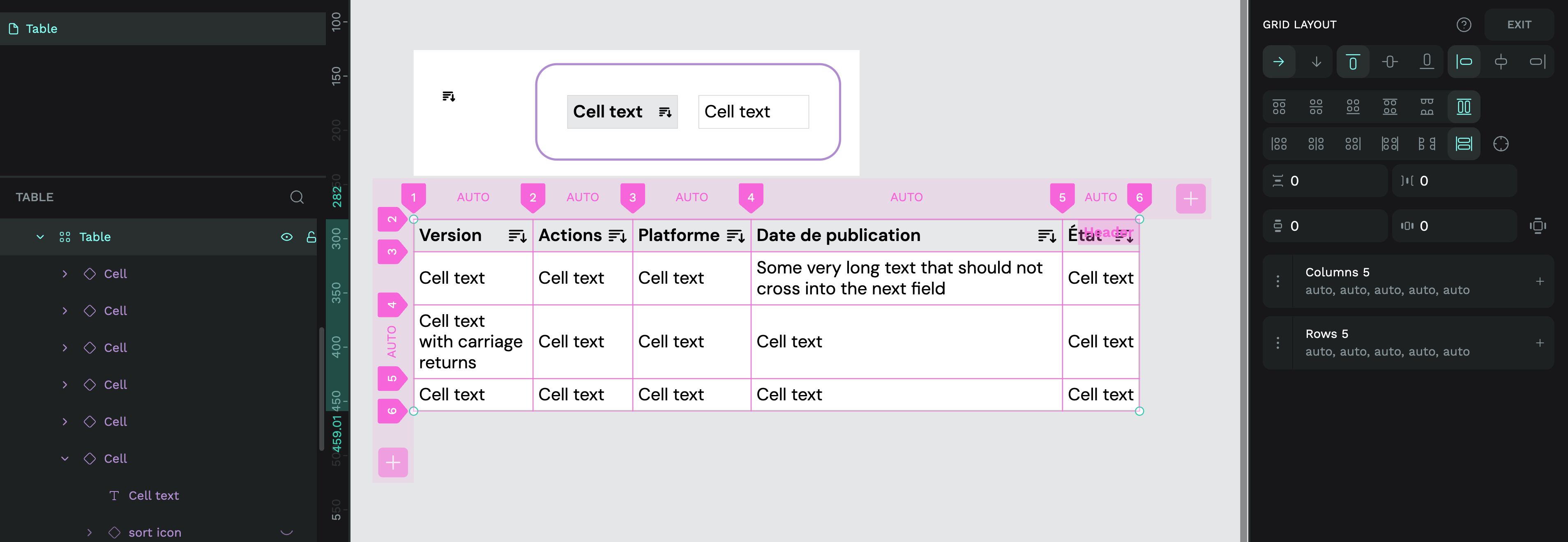
3: To make sure the grid expands and collapses to fit the cell content, the table is one grid layout with the width and height all set to auto. This makes the grid fit the size of the content inside each cell.
I think that I have a problem because my borders are rectangle objects, and I can’t cheat/hack with the 0,5 border because I don’t want the border on all sides. So I can’t use the space-between in flex.