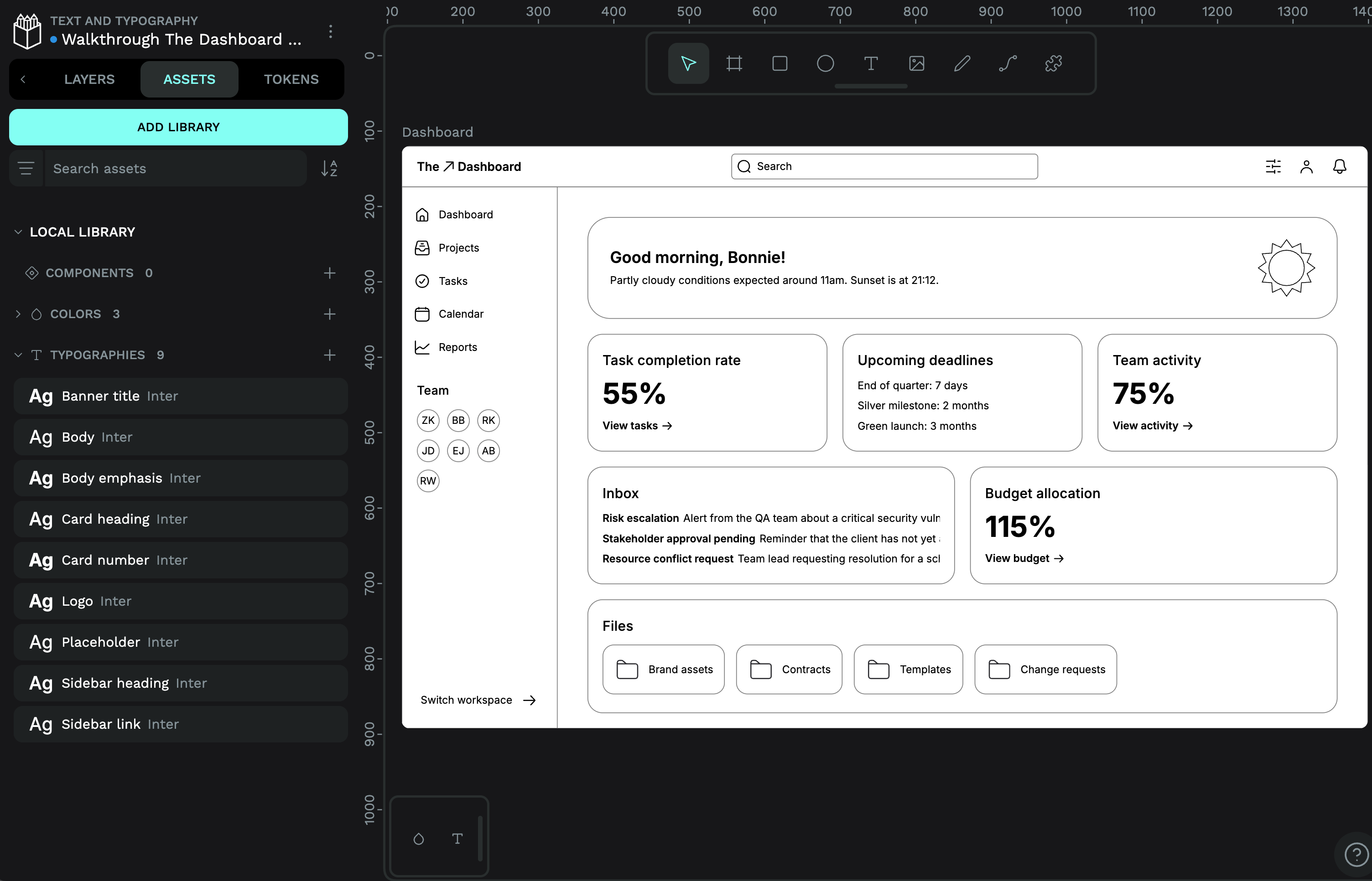
This is so great! The rounded shapes of the letters really complements the rounded corners of the interface. Your choice instantly makes the dashboard feel more modern. And my eye is drawn to all the important info and headings first–something that’s easy to recognise when you look at a zoomed-out version of a mockup like this.
I have used Catamaran as the font choice because it is sans serif and has some rounded details. I left the greeting a bit bigger but I hope it is not conflicting with the important info. I felt it was important to the tone somwhow.
The course is great. I am a developer so I am learning quite a lot.
The rounded details have so much character. I also love your choice to make the sidebar navigation into uppercase, it works really well at conveying the hierarchy of the dashboard, projects, tasks etc as being the top level navigation.