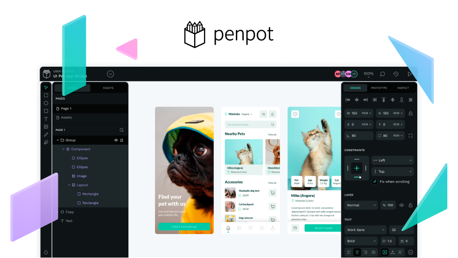
Without talking about any interface other than Penpot’s, I can provide some context behind the reasoning behind the rejection of the proposal that Pablo showed above.
During the definition stage of our new UI, we created many exploratory versions. This one was undoubtedly one of our favorites internally, and we even brought it to an almost finalized state. However, in a design review involving nearly the entire Penpot design team, we concluded that some aspects were not entirely convincing:
-
One of our motivations for the redesign was to prioritize the designed content by optimizing the available real estate. Floating sidebars practically result in a loss of space because they require margins that serve no practical purpose.
-
Another of our objectives was to reduce the cognitive load of the interface to promote focus on the designed artifacts. This option did not align well with that goal for various reasons, such as the designs blending more easily with the interface due to showing in the separator spaces, where they added no functionality and left it unclear whether we should allow interaction with the layers.
-
Additionally, there were other issues, such as the difficult positioning of the rulers and others that, to be honest, I do not fully remember (I should look for my notes).
All these factors led us to iterate further. We believe the version we released better achieves the goals of giving prominence to the content and reducing visual noise. We might be wrong, and we have room for improvement for sure. But overall, we feel that some internal stats and especially the feedback from the community have validated our proposal.
