Hi,
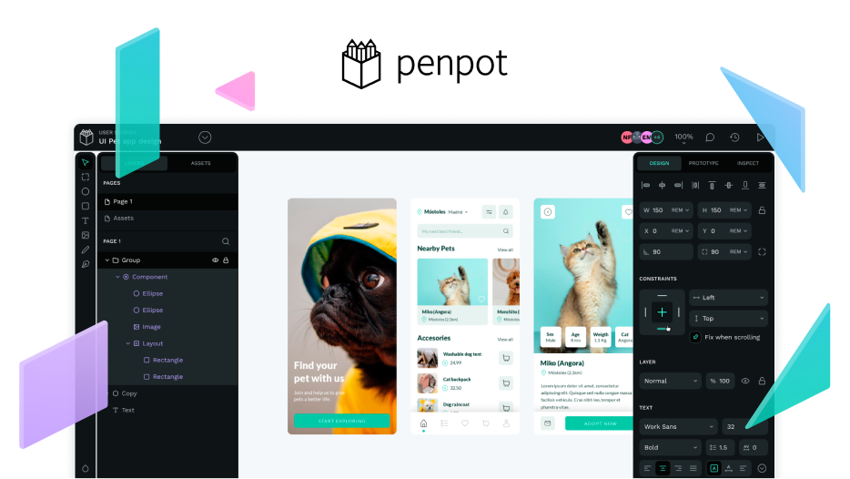
Thanks a lot for sharing the design system used by Penpot.
Being able to study it is very useful for understand what a design systems is and how it works.
I share two questions and some reflections:
- How would this design system be if design tokens would have been applied?
I made the experiment of importing Pencil file into the Tokens Studio instance of Penpot. It has some design tokens capabilities activated. The supported tokens right now by Tokens Studio instance are color, border radius, dimensions, opacity, rotation, sizing, spacing, stroke width.
I was able to create the color tokens, which I share with this post and also observe some incoherence in border radius from some components.
checkbox: 4
(Select, Input, Button group, Combo Button … ): 8
Components_list: 6
Components_grid: 9.1, 9.23
Button: 15.25, 15.46
It would be good to publish the design tokens file and the pencil design system update it with design tokens applied to it. As showned in the Roadmap the launch would be between Q1 and Q2.
- Is Pencil design system accessible and how can I create an accessible design system and use it in Penpot?
I have been trying to replicate pencil design system using Accesibility Theme Builder and managed to progress a bit. I share

I tried to upload the pencil design tokens json but it is a filetype that currently is not enable in the forum system. I share the text bellow.
pencil-tokens.json
{
“Global”: {
“l”: {
“color”: {
“accent”: {
“primary”: {
“$value”: “#6911d4”,
“$type”: “color”
},
“secondary”: {
“$value”: “#1345aa”,
“$type”: “color”,
“$description”: “”
},
“tertiary”: {
“$value”: “#8c33eb”,
“$type”: “color”
},
“quarternary”: {
“$value”: “#ff6fe0”,
“$type”: “color”
},
“error”: {
“$value”: “#ff3277”,
“$type”: “color”
}
},
“background”: {
“primary”: {
“$value”: “#ffffff”,
“$type”: “color”
},
“secondary”: {
“$value”: “#e8eaee”,
“$type”: “color”
},
“tertiary”: {
“$value”: “#f3f4f6”,
“$type”: “color”
},
“quaternary”: {
“$value”: “#eef0f2”,
“$type”: “color”
},
“error”: {
“$value”: “#ffcada”,
“$type”: “color”
}
},
“foreground”: {
“secondary”: {
“$value”: “#495e74”,
“$type”: “color”
}
}
}
},
“d”: {
“color”: {
“accent”: {
“primary”: {
“$value”: “#7efff5”,
“$type”: “color”
},
“secondary”: {
“$value”: “#bb97d8”,
“$type”: “color”
},
“tertiary”: {
“$value”: “#00d1b8”,
“$type”: “color”
},
“quaternary”: {
“$value”: “#ff6fe0”,
“$type”: “color”
},
“error”: {
“$value”: “#c80857”,
“$type”: “color”
},
“info”: {
“$value”: “#0e9be9”,
“$type”: “color”
},
“success”: {
“$value”: “#2d9f8f”,
“$type”: “color”
},
“warning”: {
“$value”: “#fe4811”,
“$type”: “color”
}
},
“background”: {
“primary”: {
“$value”: “#18181a”,
“$type”: “color”
},
“secondary”: {
“$value”: “#000000”,
“$type”: “color”
},
“tertiary”: {
“$value”: “#212426”,
“$type”: “color”
},
“quaternary”: {
“$value”: “#2e3434”,
“$type”: “color”
},
“error”: {
“$value”: “#500124”,
“$type”: “color”
},
“info”: {
“$value”: “#082c49”,
“$type”: “color”
},
“success”: {
“$value”: “#0a2927”,
“$type”: “color”
},
“warning”: {
“$value”: “#441606”,
“$type”: “color”
}
},
“foreground”: {
“primary”: {
“$value”: “#ffffff”,
“$type”: “color”
},
“secondary”: {
“$value”: “#8f9da3”,
“$type”: “color”
}
}
}
},
“component”: {
“avatar”: {
“mauve”: {
“$value”: “#cbaaff”,
“$type”: “color”
},
“orange”: {
“$value”: “#f9b489”,
“$type”: “color”
},
“pink”: {
“$value”: “#f49ef7”,
“$type”: “color”
}
}
}
},
“$themes”: [ ]
}