Struggling to use Penpot Tokens and Components

Site Architecture Map.penpot (268.3 KB)

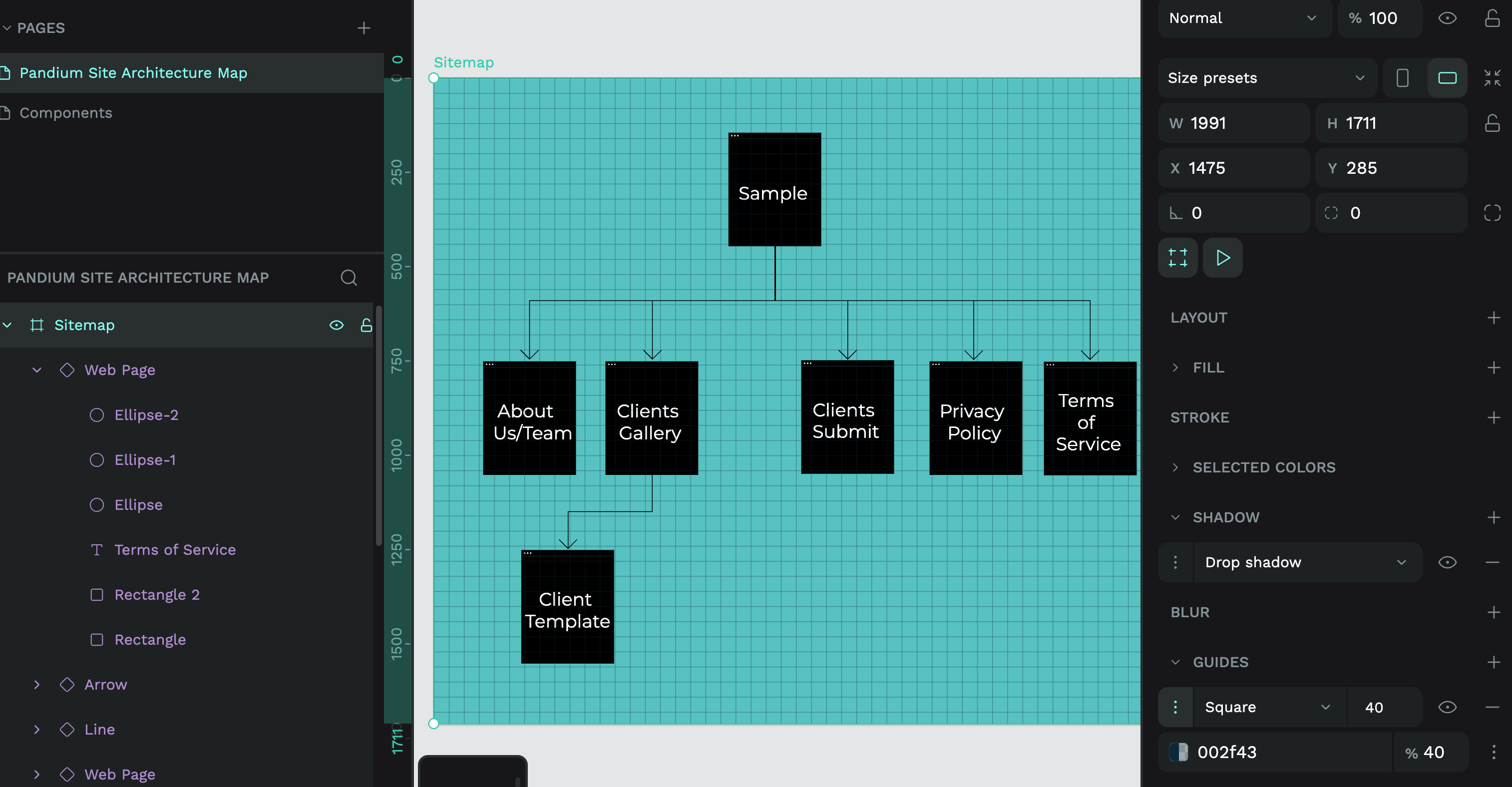
Hi everyone, I made a site architecture map in Penpot but I can’t figure out why it’s not very maintainable.

Problems I’ve noticed:

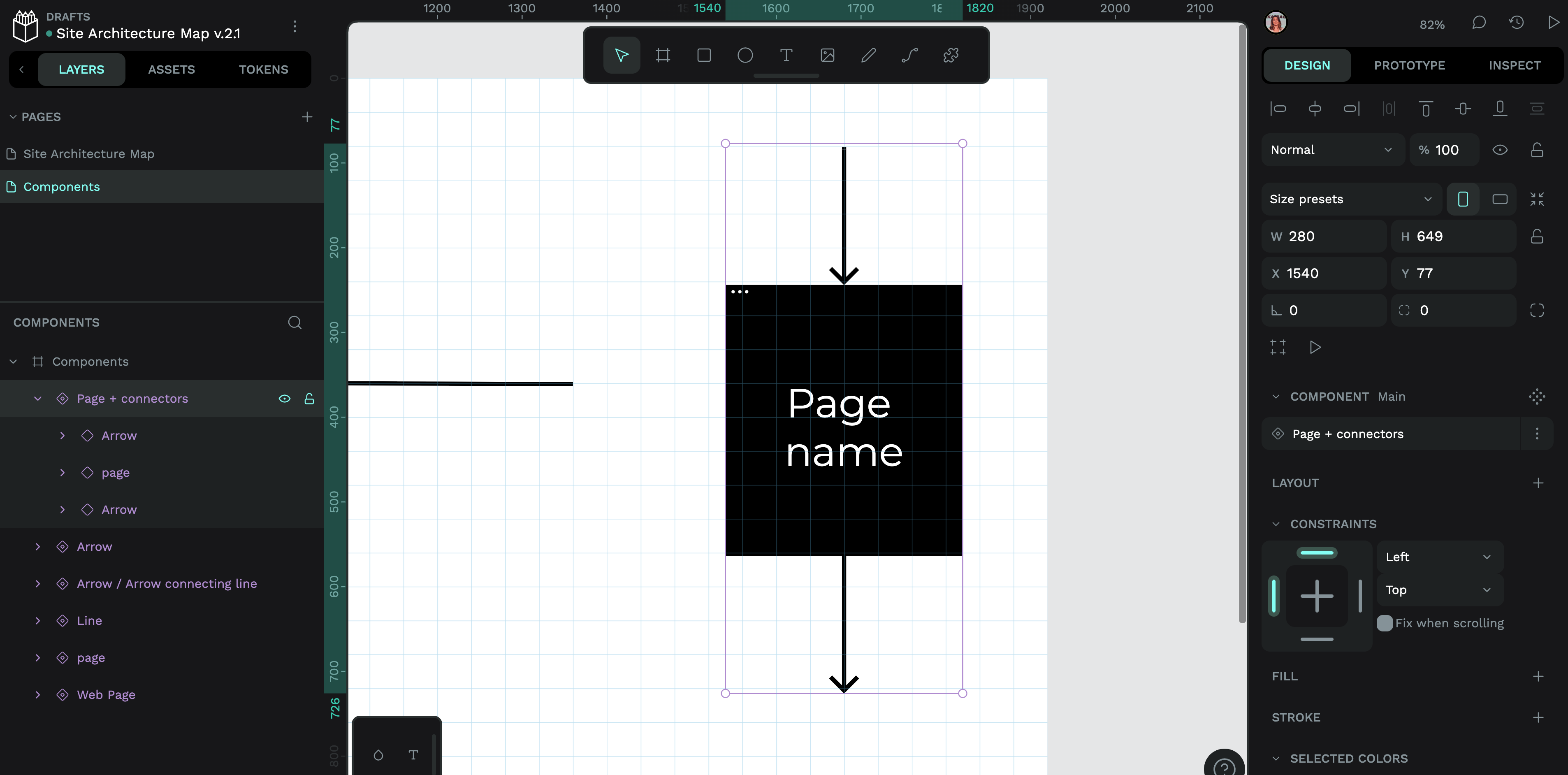
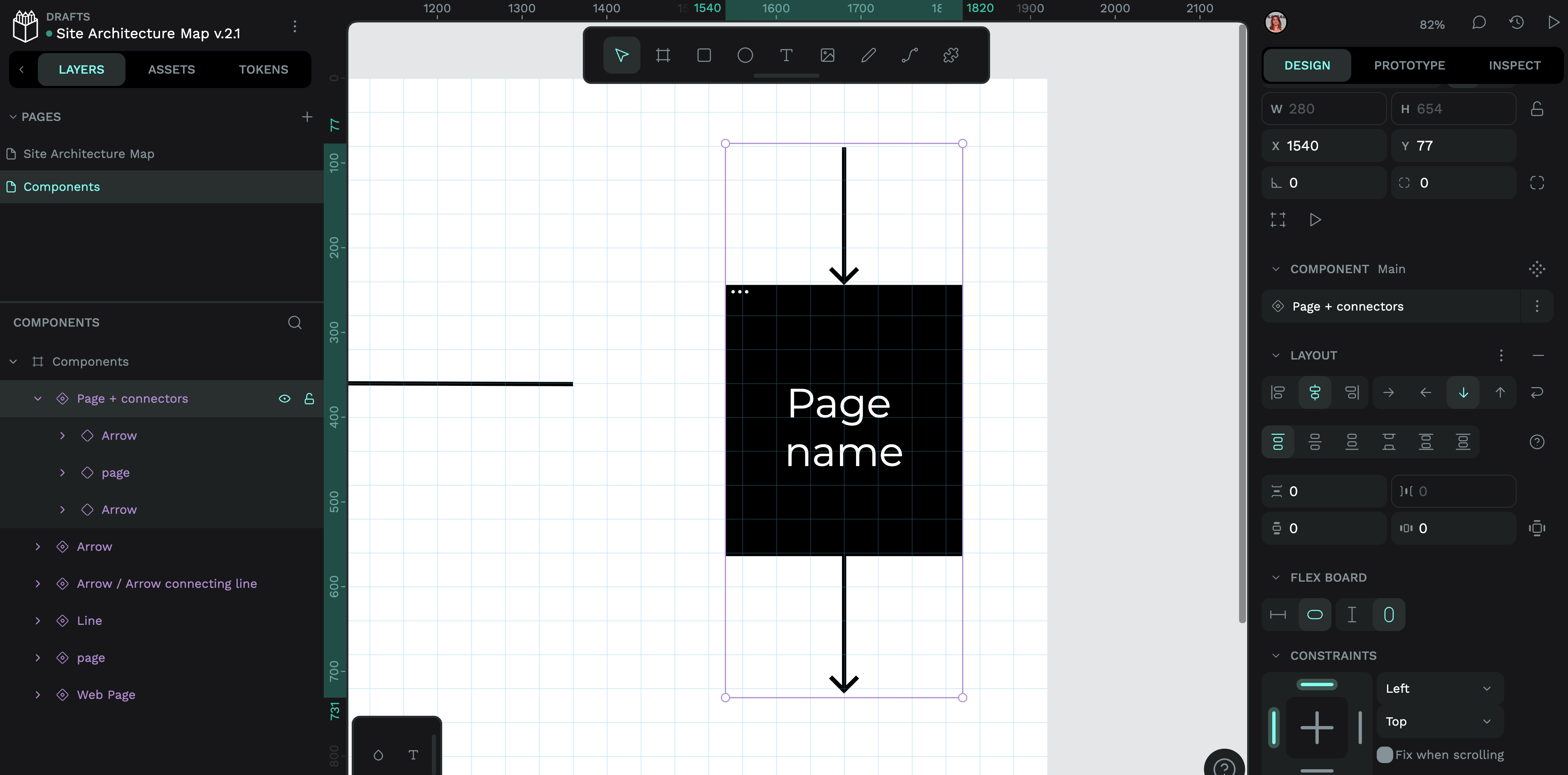
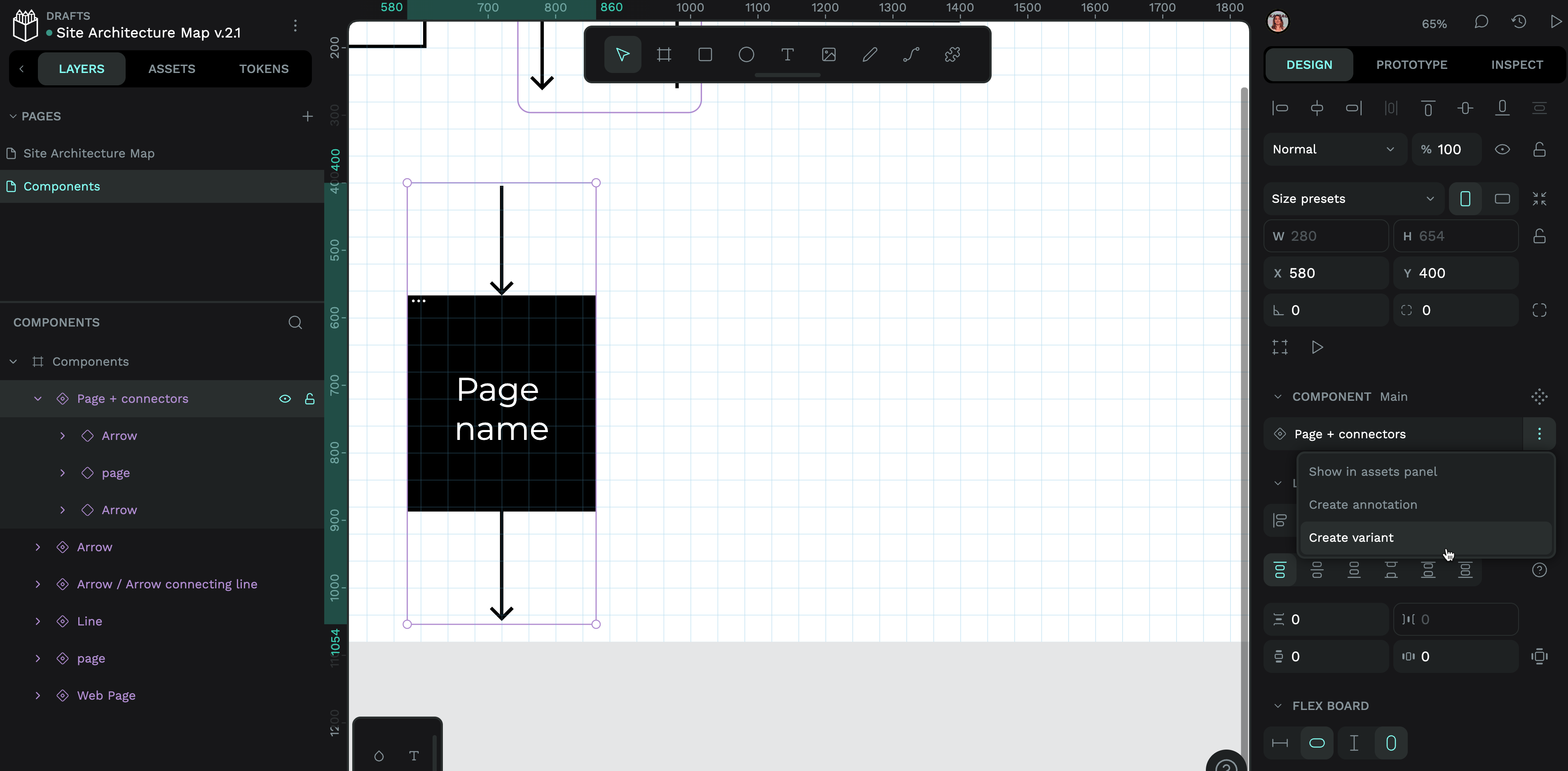
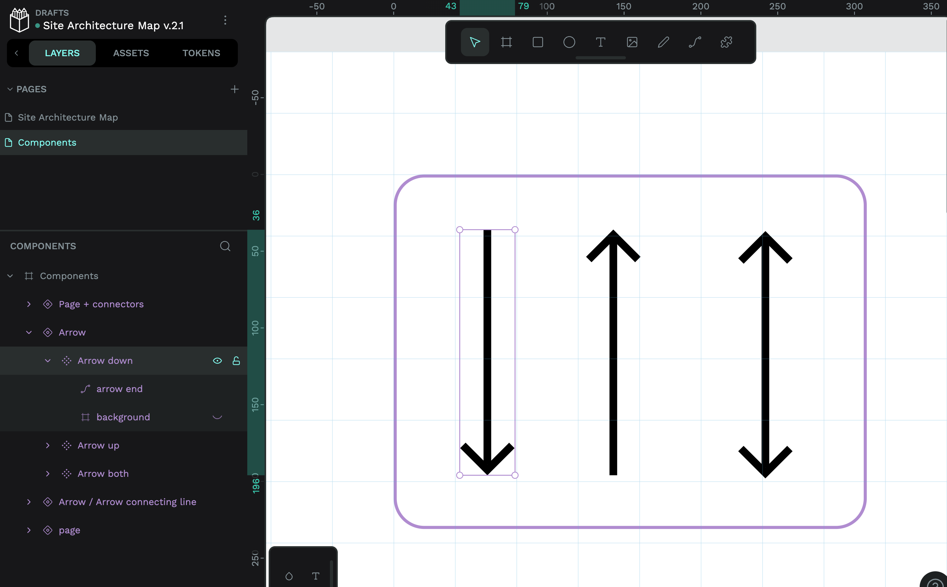
  • I don’t know how to make the pointy part of the arrow’s dimensions fixed while I can scale the lines to connect the nodes with the individual boxes. I made a workaround by making the pointy bit a component and the arrow another one, but there’s got to be a better way to do this.
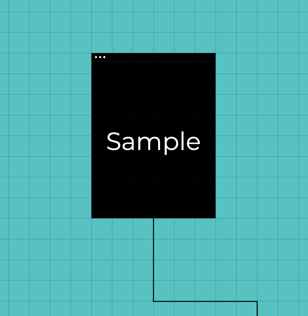
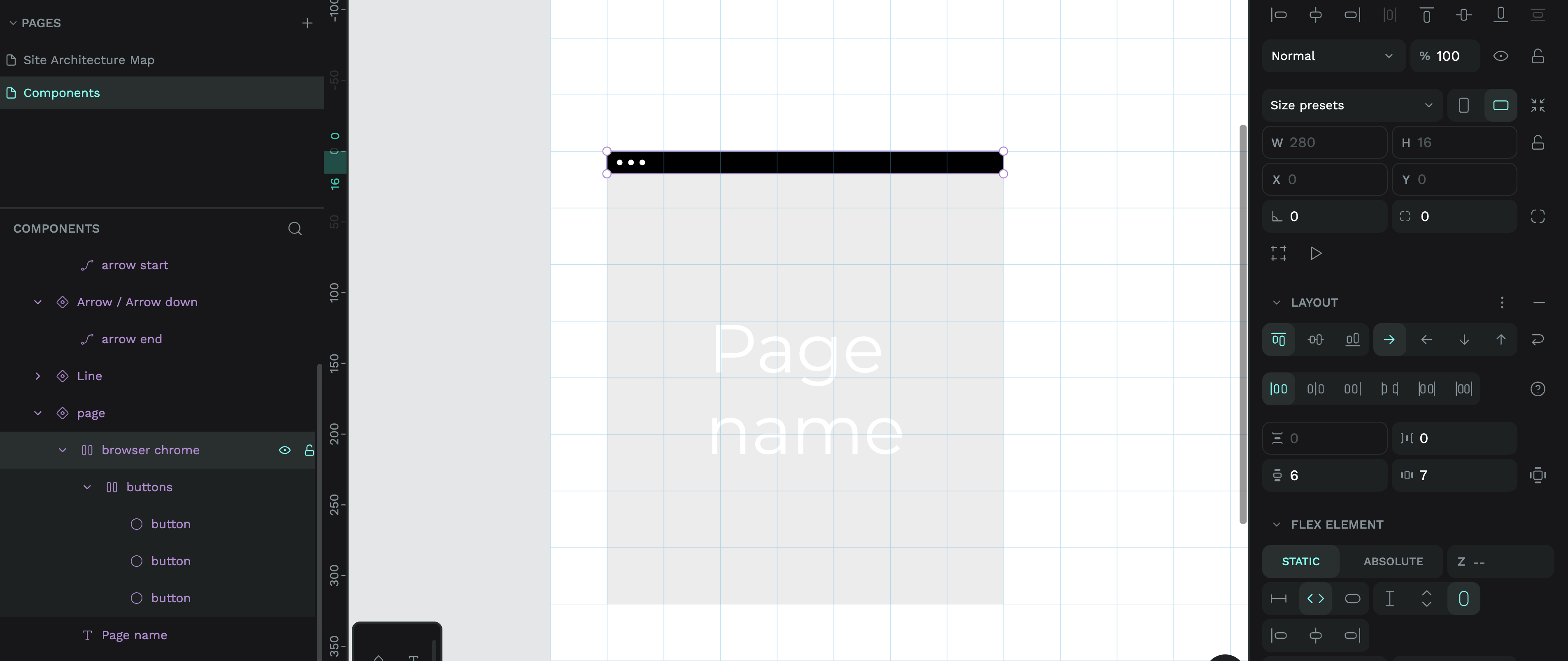
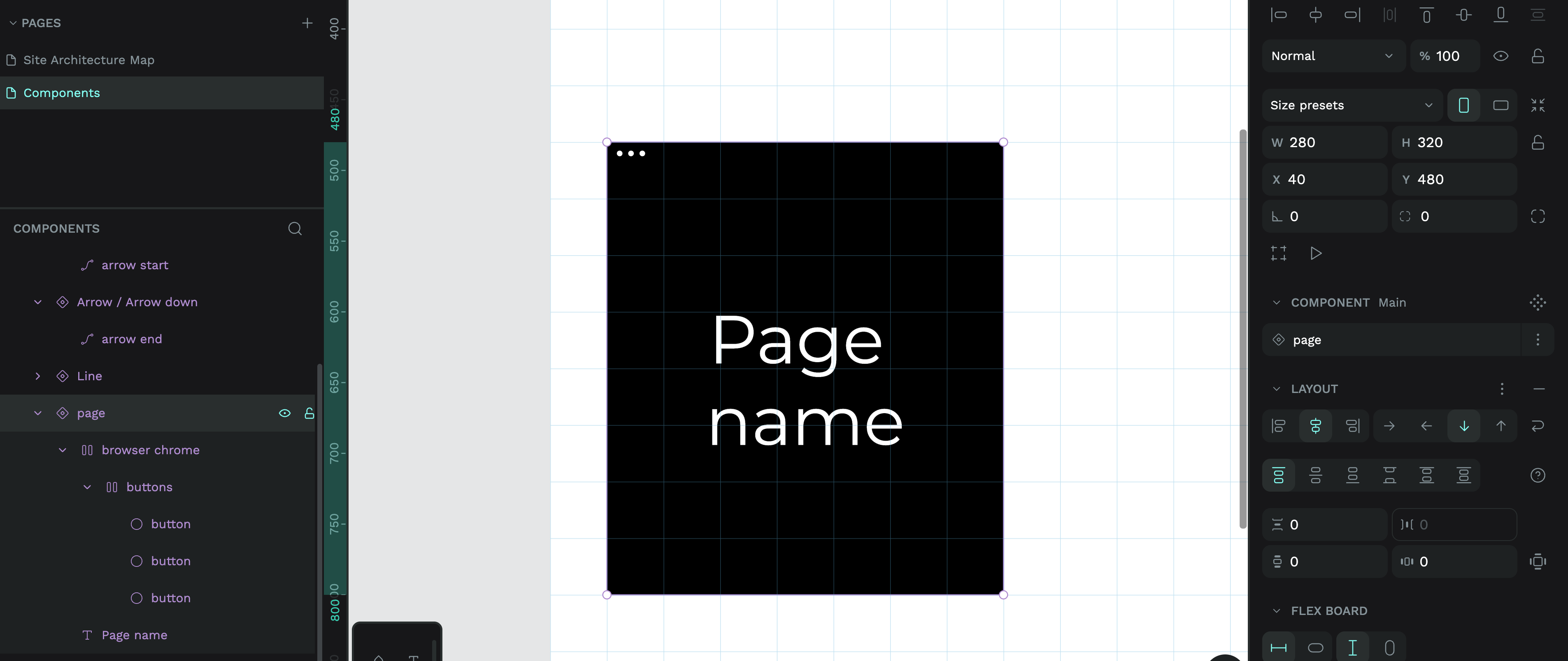
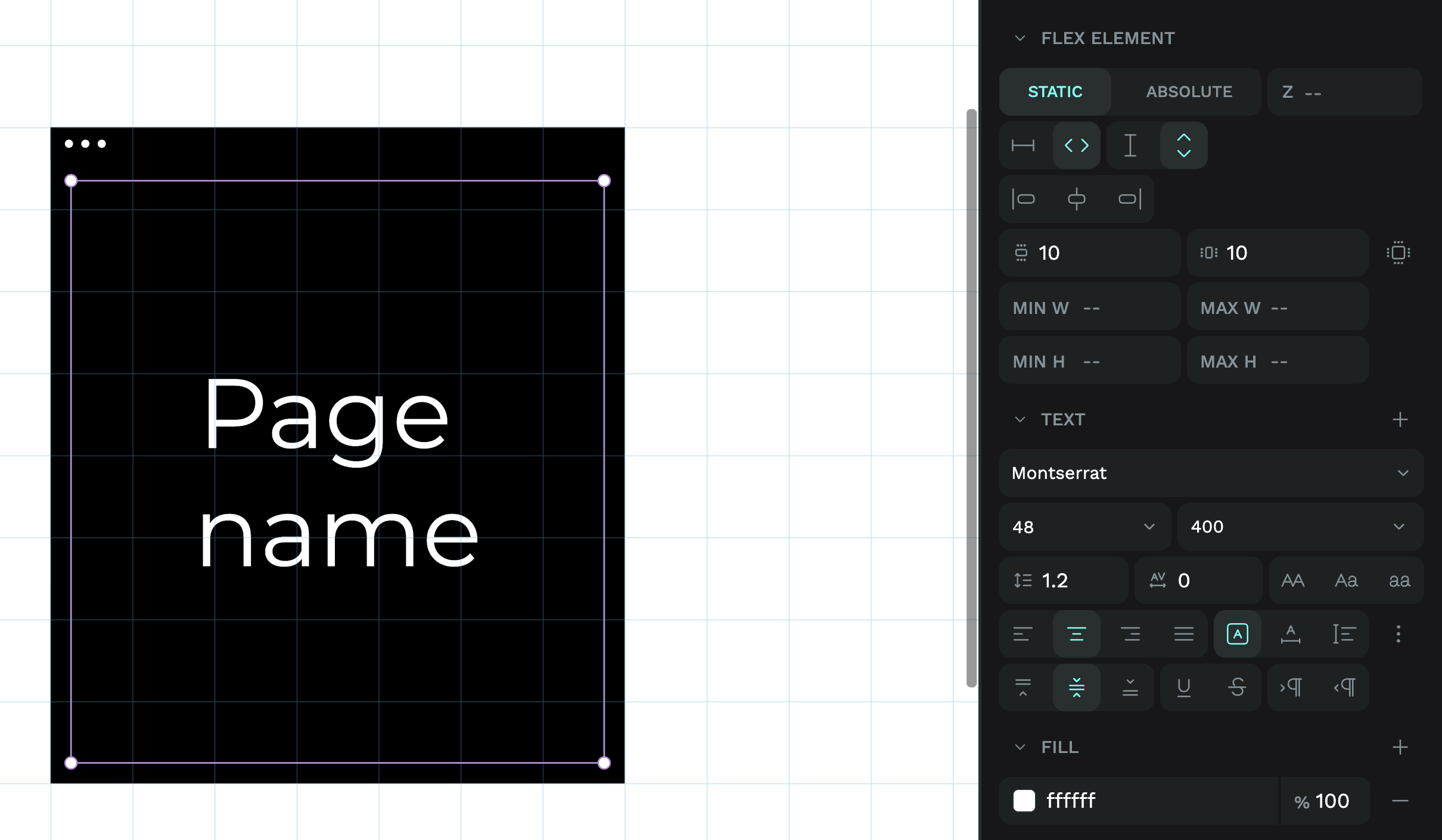
  • The text in the box are supposedly centered but you can see “Client Template” isn’t actually centered; I’m not sure why that’s happening.
  • The boxes are not spaced out evenly, solely arbitrarily. I tried to use Spacing Tokens to make spacing but couldn’t figure out how to apply them.

I’ve been reading the documentation and the YouTube videos and I would appreciate your help as I’m trying to convince my company to use Penpot for design work, but if I can’t figure out how to use it in a more scalable, maintainable, and responsive way then what’s the point? I only know how to make like really shoddy first-draft versions but need help to polish this site architecture map.

Your help is greatly appreciated.

This isn’t a terrible workaround. But the easiest solution would probably be to use stroke arrows instead of custom arrows. You can use your existing path lines and then set the end of each path to “Arrow” in the stroke settings. There are two different arrow styles, and the size of the arrow scales with the thickness of the path.

If you want to customise the style of the arrow beyond these settings, I think your current approach is the best way.

This is because the text is exceeding the width of its box. You can tell this when you select the Text layer (see that the Client text is actually centre-aligned to the box).

You can fix this by making the box wider:

I would be tempted to make each of these web page boxes into flex layouts, so that you can automate making the text box fill the width of the web page box.

Do you need to make this layout responsive? I think that would be tricky but not impossible, let me know if you want pointers on how to do this (I would probably use grid layout.)

If you’re using flex or grid layouts to automatically arrange your elements, then spacing tokens are valuable because they can automate the spacing in your layout. Spacing tokens only work on padding, margins, and gaps. This explains why you couldn’t work out how to use them, as there are no flex or grid layouts used in your design.

For a static layout like this, where you’ve positioned elements manually, I would probably use a background guide to help align my elements. You can add a guide to any layer (I would add it to the board) from the Design panel:

Once you have a guide, you can move and resize your elements so they fit the guide squares, creating a more uniform layout:

For spacing, I would think in multiples of squares. So in a row of web pages, I might choose to consistently use four empty squares between each page.

I hope that makes sense! Please let me know if there’s any specific videos or blog tutorials that would help you out in future. I always appreciate feedback and ideas :smile:

4 Likes

Thank you for the prompt help! Going above and beyond~ This is why I stick with Penpot even if I don’t know what’s happening XD.

I was able to use the guide and I resized the pages to fit the squares. I don’t think I need flex or grid layouts for the sitemap, but I think I should learn how to use them since I want to make a design style guide next.

Site Architecture Map v.2.penpot (304.1 KB)

It’s looking a lot better, but I think I’m still missing a couple of pieces.

  • Is there a way to make the arrows auto align with the center of the boxes?
    • The arrows are vectors.
  • Is there a way to make the arrows align on top of each other perfectly? Otherwise there’s like fuzziness, and like I’m zooming in like 300% to try to align perfectly but like I feel there’s some way to probably snap it on.
  • Even though my snap to ruler guides is enabled, the boxes don’t snap to the grids… The right box cut off on the right is because I manually like zoomed in 300% to align but I think there’s probably a less manual way of doing it.

I now also know that you made a Penpot course so I’ll get started on those modules to help me get used to the UI and Penpot fundamentals. Penpot UI Design Course

1 Like

These are my introductory tutorial and video on flex and grid layouts:

I’ll get into a good use case for flex in your diagram further down :wink:

To help solve both of these issues, I’d recommend breaking the arrows into two parts: the connecting paths that join the pages to the previous paths, and the arrow part that points directly to each page.

Then you can connect these components together to form the paths, while only needing to worry about overlapping the ends.

In order to align the arrows to each page, I’d suggest putting the start and end arrows into the web page component, and use flex to keep the centre alignment.

Starting off making the web page component into a flex layout:

  1. I started by making the browser buttons into a flex layout by selecting the circles and adding a flex layout. This keeps the buttons aligned to each other from left to right, with an equal gap of 4 between them.

  1. Then I created a group around those buttons and made that into a flex layout. This forms the box for our browser chrome bar. (You can only really tell it has a bar background if you hide the page background.) This is another flex layout flowing from left to right, and it has a black fill background.

    In order to make the bar the same height and width as the original design, I added 6 vertical padding and 7 horizontal padding. When added to the height of button group, this equals the correct bar height. I made the height of the flex board layout fit the content, so it will stay the same height unless the buttons layout is changed.

    I used fill width for the flex board width, so it will fill the width of the page, regardless of how it is resized. (Note that you can’t set fill width until you’ve created a flex layout around the browser bar, so it has a width to fill.)

    The layout is left-aligned, which means the buttons will always stick to the left side, even if the page is resized.

  1. Then I added a group around the browser chrome and text for the page itself, and made it into a flex layout. This has a black fill background too. Unlike the other flex layouts, this is aligned in column layout, flowing from top to bottom. This makes the browser bar appear above the text. And it’s all centre-aligned to ensure the objects inside the page will be aligned to the centre if they don’t fill its width.

    The height and the width of the page is fixed at 280x320, so the flex board layout is set to fixed height and width.

  1. Finally we come to the text. It doesn’t need a flex layout because its layout is dictated by its containing group, the page layer. But it has a few options we can apply to it as a flex element (an element inside a flex layout.)

    I make the text box fill both the width and height of its parent container. Then I add vertical and horizontal margins of 10 to make sure the text always has a little space inside the page surrounding it.

    The text itself is centre-aligned both horizontally and vertically, so no matter the length of the text, it’ll sit in the middle of the page.

Once I made my page component, I took the two arrow components and combined them to make a single arrow component with variants.

I gave both variants the property of direction, one variant is arrow up, the other variant is arrow down:

Now I have my arrow variants, I can make a component that combines the arrows with the page.

  1. I select a copy of the page component and two copies of the arrow component and create a component:

  1. Then I add a flex layout to that component where the layout flows top to bottom in a column, and is centre-aligned. The flow ensures the arrows stick to the either end of the page, and the alignment ensures the arrows are always exactly centre-aligned to the page.

  2. Next I create variants for the different arrow combinations in my page + connectors component. This time, using the create variants button from the component options menu to create three variants:

  1. I name the shared property of each variant “connectors” and then delete the arrows as needed for the variant of connectors = in, connectors = out, and connectors = in + out. These cover all the different arrow combinations I’ll need for the diagram.

  1. At this point, I also realised I needed an arrow direction = both variant for the arrows. And I could easily make that tweak without it affecting my page + connectors component:

With all these components I can now quickly recreate the layout by dragging and dropping, only needing to add text, switch between variants, and adjust the length of the connecting lines:

You can download my version of the file below:

Site Architecture Map v.2.1.penpot (438.8 KB)

Sidenote: The exact arrow path alignment was proving tricky because of the extra pixels created by the arrow head and ends. To solve this, I added an equal size board around each arrow and resized the component to fit the board. This is the same technique used to ensure icons align optimally to a grid and each other:

2 Likes

Hahaha, I realise now this could have been a blog tutorial or hands-on demo :joy:

I thought this was an interesting use case that others have mentioned before, so I really hope folks find it useful!

2 Likes

Thanks @LauraKalbag for this extra in-depth tutorial :slight_smile:

It’s really nice to watch different approaches to solve technical challenges. Sometimes, we are so used to certain workflows or behaviours and miss to look at these challenges a litte bit differently. Good reminder that there is almost always a solution although sometimes not obvious immediately.

1 Like

It’s a good point that we all have different approaches, and mine is not The One True Way. Everyone brings different experiences and expertise to how they do design. I’m very interested to know if anyone else would propose an alternative approach!

2 Likes