Juan & Ege,
Such an outstanding job! You’ve done a deep dive that understands the proposal while underlining key issues, both the ones we already had in mind (validating some suspicions, which is extremely valuable) and some that we did not. At the Penpot team, we are beyond grateful.
Now, let’s get our hands dirty. We made a detailed review of the proposed suggestions and came to some conclusions. I will try to summarize them following the structure of your feedback.
Learning Curve / General
We already have evidence that supports the idea that the feature is familiar and understandable for people with previous CSS grid knowledge, which is great, but we’re not satisfied with that. We agree that the learning curve for people who don’t know CSS grid is high (more-than-acceptable-high in my opinion). We loved your proposal to provide contextual info and learning resources and will implement it (see the screenshot below with the final interface). In addition, we are exploring ways to make the interface more understandable for everyone, but this will need a bit more time to work on.

The “?” button will show a tooltip and will point to the User Guide. We’ll add it to the Flex Layout settings too ![]()
Configuration
Although we understand the reasons behind this, we are not convinced with this solution for two reasons:
- Is showing a message each time you change the grid type to intrusive? Could it interfere with your workflow? We tend to think so.
- We believe that the action is not so destructive to need this level of control. In case of changing the layout type by mistake or you think it twice you can just undo it as with any other change to get back to the previous state.
However, we’ll keep an eye on this issue just in case it comes up again in other tests, meaning that we should revisit this decision.
Naming
This is a tricky one and we still haven’t found a convincing solution (the word “Page” is a bit reductionist in this context). There’s a clash between one very standard concept with another that is also standard and happens to be a namesake… we’ll keep you posted.
Edit grid
-
We agree that the position of the “Edit grid” button is far from ideal and that its lack of consistency makes it hard to recognize. We are moving it above as per your suggestion.
We are still reluctant to change the style of the button, we have a visual system with some restrictions that we usually want to bypass for legitimate reasons (such as the one we’re talking about) but we prefer not to do it for the sake of the interface consistency. If the change of location is not enough we might reconsider this last decision. -
About the popup, totally agree, too many buttons. About the “Locate” button position, in our current tests is being proved useful as it is. We are thinking of adding it also at the sidebar, but in any case, leaving it at the popup. This is how the popup will look (again, new UI applied):

- The bug with the bin icon is already solved. Good catch!

- Accessibility: We are in the middle of a complete rework of the whole Penpot’s UI, not only in terms of the look & feel but also at the code level (components, CSS, etc). Some of the issues like the ones that you mentioned are being taken care of with this rework and I’m sure that we’ll still have work to do after that. If you want to keep looking for accessibility issues the best will be to wait for us to finish this UI revamp.
Table use case
Ok, that was unexpected ![]() , which doesn’t mean it doesn’t make sense. In fact, kind of the opposite. We’ve already had several conversations with designers and PMs from organizations that work with interfaces mainly composed of big and complex tables that need to handle huge amounts of data. The need exists and we feel that there’s an opportunity there to better solve this problem in terms of product design and development. It is not clear though that this should be a Layout option at the same level as FLex and Grid, and we prefer to treat it separately, and that’s why I’ve created this user story including your suggestion.
, which doesn’t mean it doesn’t make sense. In fact, kind of the opposite. We’ve already had several conversations with designers and PMs from organizations that work with interfaces mainly composed of big and complex tables that need to handle huge amounts of data. The need exists and we feel that there’s an opportunity there to better solve this problem in terms of product design and development. It is not clear though that this should be a Layout option at the same level as FLex and Grid, and we prefer to treat it separately, and that’s why I’ve created this user story including your suggestion.
Fun fact: While discussing this topic, we came up with the idea to add the ability to switch between CSS Grid and Table HTML formatting at the Inspect code panel.
Feel free to add comments there or open a specific post in this Community to open this conversation to more community members.
Current progress
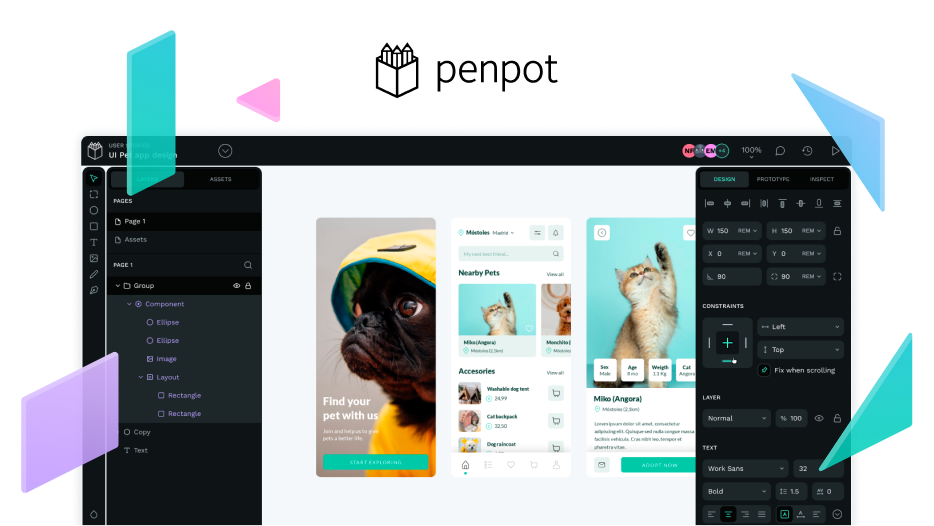
We’ve not only digested the feedback but already started implementing some of the suggestions. We have a working file at Penpot with most of your suggested improvements adapted to the new UI and ready to be implemented. This one is public and anyone can take a look at it and leave comments there.
We also have the new UI activated in the Layout Grid test environment (if you’re reading this and are one of our beta-testers, you already had this new UI from the beginning), so now is closer to the way we will release it than while the Hacktoberfest.
No need to say (but I say it) that we’d love to know your thoughts about this iteration. And I’m not talking only to Ege and Juan here, anyone is more than welcome to join this conversation!