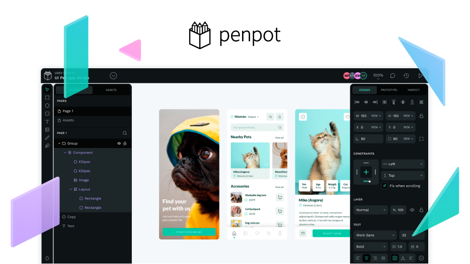
I was thinking about these changes:
General:
- Change font typeface to “Work Sans”
- Created new color palette from Penpot page
- Change paragraphs
<p>and lists<li>font size to 16px from 17.6px according to website
Homepage:
- Change heading
<h1>size and settings - Change primary button settings - radius, size, leading, inner spacing (padding), motion effects and transitions - 1:1 w/ Penpot site)
- Added new gray palette from Penpot site (I kept old one) and applied to (border, header, inputs, texts color)
- Search input update: larger radius, border color, icon color and vertical alignment, inner padding, placeholder typography settings (kerning, indented from the left side)
- Menu - font size change to 16px, font weight changed to Medium (500) - everything according to Penpot web, Added blu effect according to Penpot page
- Cards (User guide, FAQ’s etc.) - changed border, inner spacing, description text darker gray from new palette, removed green border and shadow effect on hover (it’s softer then on Penpot page, because here it looks little bit aggressive)
- Advice tag in Card (WIP) - try different approach, that fit more to rest of the page and does not look like buggy button. Please feel free to advice any changes here - it’s a bigger change.
- Github section - change font size from 17.6 to 16px, changed dashed top/bottom borders color to new gray medium
- Pre footer - changed dashed border color
Page detail
- Changed font size for leading intro text from 24px to 20px (because Work Sans have different propositions)
- Polish typography settings (maily paragraph spacing because of new font)
- Intro section cards (e.g. Quick Start, Interface) - align to the grid (see screenshot below)
And few more changes, that I will describe on PR if you agree. There you can see screenshot and video from updated version. Feel free to comment anything that you think should be changed. There is more things to improve (mobile version, heading settings in articles etc.) but I would like to start with this and confirm, if it add value for you.
There is screenshot and video from Homepage and detail:
Video (not sure if this approach is useful and you can focus on details), it’s better to run docs and compare it in browser.
Please, let me know, if it was useful for you and if I can prepare PR for you.


